# The API Contract
OpenUI Chat can work with any backend stack as long as the API contract is respected.
This page is the reference source for request and response shapes. Use [Connecting to LLM](/docs/chat/connecting) for decision guidance and [Connect Thread History](/docs/chat/persistence) for the setup flow.
Chat endpoint contract [#chat-endpoint-contract]
When you pass `apiUrl`, OpenUI sends a `POST` request with this shape:
```json
{
"threadId": "thread_123",
"messages": [{ "id": "msg_1", "role": "user", "content": "Hello" }]
}
```
* `threadId` is the selected thread ID when persistence is enabled, or `"ephemeral"` when no thread storage is configured.
* `messages` is converted through `messageFormat.toApi(messages)` before the request is sent.
If your backend already accepts the default AG-UI message shape, each message can stay in this form:
```json
{ "id": "msg_1", "role": "user", "content": "Hello" }
```
Stream response [#stream-response]
Your response stream must match one of these cases:
| Backend response shape | Frontend config |
| :--------------------------------------- | :----------------------------------------------- |
| OpenUI Protocol | No `streamProtocol` needed |
| Raw OpenAI Chat Completions SSE | `streamProtocol={openAIAdapter()}` |
| OpenAI SDK `toReadableStream()` / NDJSON | `streamProtocol={openAIReadableStreamAdapter()}` |
| OpenAI Responses API | `streamProtocol={openAIResponsesAdapter()}` |
Default thread API contract [#default-thread-api-contract]
When using `threadApiUrl="/api/threads"`, OpenUI expects the base URL plus these default path segments:
| Action | Method | URL | Request body | Response |
| :------------ | :------- | :------------------------ | :------------- | :---------------------------------------- |
| List threads | `GET` | `/api/threads/get` | — | `{ threads: Thread[], nextCursor?: any }` |
| Create thread | `POST` | `/api/threads/create` | `{ messages }` | `Thread` |
| Update thread | `PATCH` | `/api/threads/update/:id` | `Thread` | `Thread` |
| Delete thread | `DELETE` | `/api/threads/delete/:id` | — | empty response is fine |
| Load messages | `GET` | `/api/threads/get/:id` | — | message array in your backend format |
`messages` in the create request is the first user message, already converted through `messageFormat.toApi([firstMessage])`.
Thread shape [#thread-shape]
```ts
type Thread = {
id: string;
title: string;
createdAt: string | number;
};
```
Message format contract [#message-format-contract]
`messageFormat` controls both directions:
* `toApi()` shapes the `messages` array sent to `apiUrl` and `threadApiUrl/create`
* `fromApi()` shapes the array returned from `threadApiUrl/get/:id`
OpenUI ships with these built-in message converters:
| Converter | Use when your backend expects or returns... |
| :-------------------------------- | :------------------------------------------ |
| Default | AG-UI message objects |
| `openAIMessageFormat` | OpenAI chat completion messages |
| `openAIConversationMessageFormat` | OpenAI Responses conversation items |
Every persisted message should include a unique `id`. Without stable message IDs, history hydration and message updates become unreliable.
Example custom converter [#example-custom-converter]
```ts
const myCustomFormat = {
toApi(messages) {
return messages.map((message) => ({
speaker: message.role,
text: message.content,
}));
},
fromApi(items) {
return items.map((item) => ({
id: item.id,
role: item.speaker,
content: item.text,
}));
},
};
```
{/* add visual: flow-chart showing how messageFormat.toApi affects outgoing chat and thread-create requests, and how messageFormat.fromApi affects thread loading */}
Related guides [#related-guides]
* [Next.js Implementation](/docs/chat/nextjs)
* [Connect Thread History](/docs/chat/persistence)
* [Providers](/docs/chat/providers)
# Artifacts
Artifacts let a component render a compact inline preview inside the chat message and expand into a full side panel when clicked. Use them for code viewers, document previews, embedded frames, or any content that benefits from a larger canvas.
```tsx
import { defineComponent } from "@openuidev/react-lang";
import { Artifact } from "@openuidev/react-ui";
import { z } from "zod";
const ArtifactCodeBlock = defineComponent({
name: "ArtifactCodeBlock",
props: z.object({
language: z.string(),
title: z.string(),
codeString: z.string(),
}),
description: "Code block that opens in the artifact side panel",
component: Artifact({
title: (props) => props.title,
preview: (props, { open, isActive }) => (
),
panel: (props) => (
{props.codeString}
),
}),
});
```
How it works [#how-it-works]
An artifact component has two parts:
* **Preview** — a compact element rendered inline in the chat message. It receives an `open` callback to activate the side panel.
* **Panel** — the full content rendered inside `ArtifactPanel`, portaled into the `ArtifactPortalTarget` in your layout. Only one panel is visible at a time.
`Artifact()` is a factory function that wires these together. It generates a `ComponentRenderer` that handles ID generation, artifact state, and panel portaling internally. Pass the result as the `component` field of `defineComponent`.
Artifact() config [#artifact-config]
```ts
import { Artifact } from "@openuidev/react-ui";
Artifact({
title, // string | (props) => string
preview, // (props, controls) => ReactNode
panel, // (props, controls) => ReactNode
panelProps, // optional — className, errorFallback, header
});
```
| Option | Type | Description |
| ------------ | ----------------------------------------------------- | -------------------------------------------------------- |
| `title` | `string \| (props: P) => string` | Panel header title. Static string or derived from props. |
| `preview` | `(props: P, controls: ArtifactControls) => ReactNode` | Inline preview rendered in the chat message. |
| `panel` | `(props: P, controls: ArtifactControls) => ReactNode` | Content rendered inside the side panel. |
| `panelProps` | `{ className?, errorFallback?, header? }` | Optional overrides forwarded to `ArtifactPanel`. |
Both `preview` and `panel` receive the full Zod-inferred props as the first argument and `ArtifactControls` as the second.
ArtifactControls [#artifactcontrols]
The controls object passed to `preview` and `panel` render functions.
```ts
interface ArtifactControls {
isActive: boolean; // whether this artifact's panel is currently open
open: () => void; // activate this artifact
close: () => void; // deactivate this artifact
toggle: () => void; // toggle open/close
}
```
The preview typically uses `open` and `isActive` to show a click-to-expand button. The panel can use `close` to render a dismiss button inside the panel body.
Layout setup [#layout-setup]
Built-in layouts (`FullScreen`, `Copilot`, `BottomTray`) mount `ArtifactPortalTarget` automatically. Artifact panels render into this target with no extra setup.
If you build a custom layout with the headless hooks, mount one `ArtifactPortalTarget` in your layout where the panel should appear.
```tsx
import { ArtifactPortalTarget } from "@openuidev/react-ui";
function Layout() {
return (
{/* chat area */}
);
}
```
Only one `ArtifactPortalTarget` should be mounted at a time. All artifact panels portal into this single element.
Headless hooks [#headless-hooks]
For custom layouts or advanced control, use the artifact hooks from `@openuidev/react-headless`.
useArtifact(id) [#useartifactid]
Binds a component to a specific artifact by ID. Returns activation state and actions.
```ts
import { useArtifact } from "@openuidev/react-headless";
const { isActive, open, close, toggle } = useArtifact(artifactId);
```
useActiveArtifact() [#useactiveartifact]
Returns global artifact state — whether any artifact is open, and a close action. Use this in layout components that resize or show overlays when any artifact is active.
```ts
import { useActiveArtifact } from "@openuidev/react-headless";
const { isArtifactActive, activeArtifactId, closeArtifact } = useActiveArtifact();
```
Both hooks require a `ChatProvider` ancestor in the component tree.
Manual wiring [#manual-wiring]
If `Artifact()` does not fit your use case, wire the pieces directly. This is the escape hatch for full control.
```tsx
import { defineComponent } from "@openuidev/react-lang";
import { ArtifactPanel } from "@openuidev/react-ui";
import { useArtifact } from "@openuidev/react-headless";
import { useId } from "react";
const CustomArtifact = defineComponent({
name: "CustomArtifact",
props: CustomSchema,
description: "Artifact with full manual control",
component: ({ props }) => {
const artifactId = useId();
const { isActive, open, close } = useArtifact(artifactId);
return (
<>
{/* panel content */}
>
);
},
});
```
`ArtifactPanel` accepts `artifactId`, `title`, `children`, `className`, `errorFallback`, and `header` (boolean or custom ReactNode). It renders nothing when the artifact is inactive.
Related guides [#related-guides]
Create custom openui-lang components with `defineComponent`.
Build a fully custom chat UI with headless hooks.
Full reference for all headless hooks.
Adjust colors, mode, and theme overrides.
# BottomTray
`BottomTray` provides a floating chat widget instead of a full-page chat surface.
This page covers the widget-style layout for support flows, product assistants, and experiences where chat stays collapsed until a user opens it.
```tsx
import { BottomTray } from "@openuidev/react-ui";
export function App() {
return (
<>
{/* Your app */}
>
);
}
```
Controlled open state [#controlled-open-state]
```tsx
```
Use the same backend configuration props as the other layouts. The only layout-specific props are the open-state controls.
That means you can start with `BottomTray` for the UI and still reuse the same `apiUrl`, `processMessage`, `streamProtocol`, and `threadApiUrl` setup from the other layouts.
Related guides [#related-guides]
Configure endpoint, adapters, and auth headers.
Load saved threads and previous messages into the widget.
Configure the empty-state content and starter prompts.
Adjust mode and theme overrides.
# Connecting to LLM
Every chat layout needs a backend connection, but there are a few separate pieces involved:
* how the frontend sends the request
* how the backend streams the response
* what message shape the backend expects
This page introduces each one first, then shows how to choose the right combination for your backend.
apiUrl [#apiurl]
`apiUrl` is the simplest connection option. Use it when your frontend can call one backend endpoint directly and you do not need custom request logic on the client.
```tsx
import { FullScreen } from "@openuidev/react-ui";
;
```
With `apiUrl`, OpenUI sends the message history to your endpoint for you. If your backend expects a different message format, configure `messageFormat`. If you need custom headers, extra fields, or a different request body, use `processMessage` instead.
processMessage [#processmessage]
`processMessage` gives you full control over the request. Use it when you need to:
* add auth headers
* build a dynamic URL
* include extra request fields
* convert `messages` before sending them
```tsx
import { openAIMessageFormat, openAIReadableStreamAdapter } from "@openuidev/react-headless";
import { FullScreen } from "@openuidev/react-ui";
import { openuiLibrary } from "@openuidev/react-ui/genui-lib";
{
return fetch("/api/chat", {
method: "POST",
headers: {
"Content-Type": "application/json",
Authorization: `Bearer ${getToken()}`,
},
body: JSON.stringify({
messages: openAIMessageFormat.toApi(messages),
}),
signal: abortController.signal,
});
}}
streamProtocol={openAIReadableStreamAdapter()}
componentLibrary={openuiLibrary}
agentName="Assistant"
/>;
```
`processMessage` receives `threadId`, `messages`, and `abortController`, and must return a standard `Response` from your backend call.
streamProtocol [#streamprotocol]
`streamProtocol` tells OpenUI how to parse the response stream. By default, OpenUI expects the OpenUI Protocol, so only set this when your backend streams a different format.
| Backend output | Frontend config |
| :--------------------------------------- | :----------------------------------------------- |
| OpenUI Protocol | No adapter required |
| Raw OpenAI Chat Completions SSE | `streamProtocol={openAIAdapter()}` |
| OpenAI SDK `toReadableStream()` / NDJSON | `streamProtocol={openAIReadableStreamAdapter()}` |
| OpenAI Responses API | `streamProtocol={openAIResponsesAdapter()}` |
```tsx
import { openAIReadableStreamAdapter } from "@openuidev/react-headless";
;
```
messageFormat [#messageformat]
`messageFormat` controls the shape of the `messages` array sent to your backend and the shape expected when loading thread history.
| Backend message shape | Frontend config |
| :---------------------------------- | :------------------------------------------------ |
| AG-UI message shape | No converter required |
| OpenAI chat completions messages | `messageFormat={openAIMessageFormat}` |
| OpenAI Responses conversation items | `messageFormat={openAIConversationMessageFormat}` |
```tsx
import { openAIMessageFormat, openAIReadableStreamAdapter } from "@openuidev/react-headless";
import { FullScreen } from "@openuidev/react-ui";
;
```
Use `messageFormat` whenever your backend expects or returns a non-default message shape. This is especially important if you store messages for thread history.
How to choose [#how-to-choose]
Once you know what each prop does, the decision becomes:
1. Start with `apiUrl`.
2. Switch to `processMessage` only if you need auth, extra fields, dynamic URLs, or request conversion.
3. Add `streamProtocol` only if your backend does not stream the default OpenUI Protocol.
4. Add `messageFormat` only if your backend expects or returns a non-default message shape.
{/* add visual: flow-chart showing the decision between apiUrl and processMessage, then mapping backend stream output to the correct streamProtocol adapter and messageFormat choice */}
Rules summary [#rules-summary]
* `apiUrl` is the simplest path when one endpoint can handle the request as-is.
* `processMessage` is the right choice when you need auth, extra fields, or payload conversion.
* `streamProtocol` parses the response stream.
* `messageFormat` converts request messages and loaded thread history.
Related guides [#related-guides]
* [Next.js Implementation](/docs/chat/nextjs)
* [The API Contract](/docs/chat/api-contract)
* [Providers](/docs/chat/providers)
* [Connect Thread History](/docs/chat/persistence)
# Copilot
`Copilot` provides a sidebar assistant layout that stays visible alongside the rest of your application.
This layout keeps the main app screen in view while chat stays available at the side. For a full-page chat surface, see [FullScreen](/docs/chat/fullscreen). For a floating widget, see [BottomTray](/docs/chat/bottom-tray).
```tsx
import { Copilot } from "@openuidev/react-ui";
export function App() {
return (
{/* Your app */}
);
}
```
Common configuration [#common-configuration]
```tsx
```
`Copilot` only handles the UI layer. It is a good fit for support panels, assistant sidebars, and workflows where users need to keep the main screen visible while chatting.
Set up your backend connection in [Connecting to LLM](/docs/chat/connecting), connect thread history in [Connect Thread History](/docs/chat/persistence), and customize the empty state in [Welcome & Starters](/docs/chat/welcome).
Related guides [#related-guides]
Configure `apiUrl`, adapters, and auth.
Load thread lists and previous messages from your backend.
Configure the empty-state experience.
Adjust colors, mode, and theme overrides.
Override assistant, user, and composer UI.
# Custom Chat Components
You can customize specific UI surfaces without rebuilding the full chat stack:
* `composer`
* `assistantMessage`
* `userMessage`
These props replace the built-in UI entirely for that surface. If you override them, your component becomes responsible for rendering the message or composer state correctly.
Use these props when you want to swap a specific surface while keeping the built-in layout and state model. If you need to redesign the whole chat shell, use the headless APIs instead.
Custom composer [#custom-composer]
```tsx
function MyComposer({ onSend, onCancel, isRunning }) {
// your UI
}
;
```
ComposerProps [#composerprops]
```ts
type ComposerProps = {
onSend: (message: string) => void;
onCancel: () => void;
isRunning: boolean;
isLoadingMessages: boolean;
};
```
Call `onSend(text)` when the user submits. Use `onCancel()` to stop a running response.
Even a simple custom composer should still account for both `isRunning` and `isLoadingMessages`, because the composer may need to disable input while streaming or while history is still loading.
Custom assistant and user messages [#custom-assistant-and-user-messages]
```tsx
function AssistantBubble({ message }) {
return
{message.content}
;
}
function UserBubble({ message }) {
return
{String(message.content)}
;
}
;
```
The `message` prop is the full `AssistantMessage` or `UserMessage` object from `@openuidev/react-headless`.
Important behavior notes [#important-behavior-notes]
* `assistantMessage` replaces the default assistant wrapper, including the avatar/container UI.
* `userMessage` replaces the default user bubble wrapper.
* If you pass `componentLibrary` and also pass `assistantMessage`, your custom component takes priority. That means you are responsible for rendering any structured assistant content yourself.
* `composer` should handle both `isRunning` and `isLoadingMessages` so the input behaves correctly while streaming or loading history.
* If your custom assistant renderer only handles plain text, document that constraint in your app and avoid assuming `message.content` is always a simple string.
{/* add visual: image showing the default assistant bubble beside a custom assistant bubble implementation */}
Related guides [#related-guides]
* [Headless Intro](/docs/chat/headless-intro)
* [Custom UI Guide](/docs/chat/custom-ui-guide)
* [GenUI](/docs/chat/genui)
# Custom UI Guide
This guide shows a complete headless composition with:
1. `ChatProvider` for backend configuration
2. `useThreadList()` for the sidebar
3. `useThread()` for messages and the composer
The goal is to show how those pieces fit together in one working example, not to prescribe a specific visual design.
```tsx
import { useState } from "react";
import {
ChatProvider,
openAIMessageFormat,
openAIReadableStreamAdapter,
useThread,
useThreadList,
} from "@openuidev/react-headless";
function ThreadSidebar() {
const { threads, selectedThreadId, isLoadingThreads, selectThread, switchToNewThread } =
useThreadList();
return (
);
}
function MessageList() {
const { messages, isRunning } = useThread();
return (
);
}
export default function App() {
return (
{
return fetch("/api/chat", {
method: "POST",
headers: { "Content-Type": "application/json" },
body: JSON.stringify({
messages: openAIMessageFormat.toApi(messages),
}),
signal: abortController.signal,
});
}}
threadApiUrl="/api/threads"
streamProtocol={openAIReadableStreamAdapter()}
messageFormat={openAIMessageFormat}
>
);
}
```
This example uses the same backend assumptions as the built-in layouts:
* `openAIMessageFormat.toApi(messages)` is called explicitly in `processMessage` to convert messages to OpenAI format — the `messageFormat` prop does not transform messages for `processMessage`
* `messageFormat={openAIMessageFormat}` is still needed here because `threadApiUrl` is set — it tells the UI how to convert messages when loading saved thread history
* `openAIReadableStreamAdapter()` matches `response.toReadableStream()`
* `threadApiUrl` enables saved thread history
If you want Generative UI in a headless build, you also need to render structured assistant content yourself instead of relying on the built-in `componentLibrary` behavior from the layout components.
{/* add visual: flow-chart showing ChatProvider feeding ThreadSidebar, MessageList, and Composer through useThreadList and useThread */}
Related guides [#related-guides]
* [Headless Intro](/docs/chat/headless-intro)
* [Hooks & State](/docs/chat/hooks)
* [Connecting to LLM](/docs/chat/connecting)
# End-to-End Guide
This guide shows a complete OpenUI Chat setup in an existing Next.js App Router project.
This path covers:
* a built-in chat layout
* an OpenAI-backed route handler
* frontend request wiring with `processMessage`
* the correct stream adapter and message format
* optional thread history
* optional headless customization
{/* add visual: flow-chart showing frontend page -> processMessage -> /api/chat route -> OpenAI -> toReadableStream() -> openAIReadableStreamAdapter() -> rendered UI with componentLibrary */}
Prerequisites [#prerequisites]
Complete [Installation](/docs/chat/installation) first, then return here to wire the chat flow.
1. Generate the system prompt [#1-generate-the-system-prompt]
If you want Generative UI, generate a system prompt from the component library. The backend loads this prompt and sends it to the model with each request.
If you only want plain text chat, you can skip this step and omit `componentLibrary` in the next examples.
```bash
npx @openuidev/cli@latest generate ./src/library.ts --out src/generated/system-prompt.txt
```
Where `src/library.ts` exports your library:
```ts
export {
openuiLibrary as library,
openuiPromptOptions as promptOptions,
} from "@openuidev/react-ui/genui-lib";
```
Add this as a prebuild step in `package.json`:
```json
"scripts": {
"generate:prompt": "openui generate src/library.ts --out src/generated/system-prompt.txt",
"dev": "pnpm generate:prompt && next dev",
"build": "pnpm generate:prompt && next build"
}
```
This prompt tells the model which UI components it is allowed to emit.
2. Create the streaming backend route [#2-create-the-streaming-backend-route]
Create `app/api/chat/route.ts`:
```ts
import { readFileSync } from "fs";
import { join } from "path";
import { NextRequest } from "next/server";
import OpenAI from "openai";
const client = new OpenAI();
const systemPrompt = readFileSync(join(process.cwd(), "src/generated/system-prompt.txt"), "utf-8");
export async function POST(req: NextRequest) {
try {
const { messages } = await req.json();
const response = await client.chat.completions.create({
model: "gpt-5.2",
messages: [{ role: "system", content: systemPrompt }, ...messages],
stream: true,
});
return new Response(response.toReadableStream(), {
headers: {
"Content-Type": "text/event-stream",
"Cache-Control": "no-cache, no-transform",
Connection: "keep-alive",
},
});
} catch (err) {
console.error(err);
const message = err instanceof Error ? err.message : "Unknown error";
return new Response(JSON.stringify({ error: message }), {
status: 500,
headers: { "Content-Type": "application/json" },
});
}
}
```
The system prompt is loaded from the file generated by the CLI. The route only receives messages from the frontend — the prompt never leaves the server.
3. Render a layout and connect it to the route [#3-render-a-layout-and-connect-it-to-the-route]
`FullScreen` is a good baseline because it includes both the thread list and the main chat surface.
This guide uses `processMessage` instead of `apiUrl` so the request body stays explicit.
```tsx
import { openAIMessageFormat, openAIReadableStreamAdapter } from "@openuidev/react-headless";
import { FullScreen } from "@openuidev/react-ui";
import { openuiLibrary } from "@openuidev/react-ui/genui-lib";
export default function Page() {
return (
);
}
```
Why this setup matters:
* `processMessage` gives you control over the request body
* `openAIMessageFormat.toApi(messages)` converts messages to OpenAI format before sending
* `openAIReadableStreamAdapter()` matches `response.toReadableStream()`
* `componentLibrary={openuiLibrary}` lets the UI render structured responses
Checkpoint [#checkpoint]
At this point, you should be able to send a message and receive streamed responses in the UI.
Guides: [Connecting to LLM](/docs/chat/connecting), [Next.js Implementation](/docs/chat/nextjs), [Providers](/docs/chat/providers)
4. Connect Thread History (optional) [#4-connect-thread-history-optional]
Stop here if you only need a working streamed chat UI.
Continue with this section only if your app also needs saved threads and message history from the backend.
If you want the UI to load saved threads and previous messages, add `threadApiUrl` and implement the default thread contract described in [Connect Thread History](/docs/chat/persistence).
```tsx
{
return fetch("/api/chat", {
method: "POST",
headers: { "Content-Type": "application/json" },
body: JSON.stringify({
messages: openAIMessageFormat.toApi(messages),
}),
signal: abortController.signal,
});
}}
threadApiUrl="/api/threads"
streamProtocol={openAIReadableStreamAdapter()}
messageFormat={openAIMessageFormat}
componentLibrary={openuiLibrary}
agentName="Assistant"
/>
```
When using `processMessage`, you must call `openAIMessageFormat.toApi(messages)` explicitly in the request body — the `messageFormat` prop does not transform messages for `processMessage`. The `messageFormat={openAIMessageFormat}` prop here is for `threadApiUrl`: it tells the UI how to convert messages when loading saved thread history from the backend.
5. Switch layouts or go headless (optional) [#5-switch-layouts-or-go-headless-optional]
This step does not change your backend contract. It only changes the UI layer that sits on top of the same chat and thread wiring.
Once the backend contract is working, you can keep the same chat wiring and swap the UI layer.
* Use [Copilot](/docs/chat/copilot) for a sidebar layout
* Use [BottomTray](/docs/chat/bottom-tray) for a floating widget
* Use [Headless Intro](/docs/chat/headless-intro) and [Custom UI Guide](/docs/chat/custom-ui-guide) for full UI control
You now have [#you-now-have]
* a streaming `/api/chat` route
* a connected chat layout
* the correct OpenAI message conversion and stream adapter
* optional GenUI support
* a clear path to thread history and headless customization
Next steps [#next-steps]
* [Connect Thread History](/docs/chat/persistence)
* [GenUI](/docs/chat/genui)
* [Custom UI Guide](/docs/chat/custom-ui-guide)
# FullScreen
`FullScreen` provides a full-page chat layout with the built-in thread list and main conversation area.
This page covers the complete built-in layout. For a sidebar inside an existing app screen, see [Copilot](/docs/chat/copilot). For a floating widget, see [BottomTray](/docs/chat/bottom-tray).
```tsx
import { FullScreen } from "@openuidev/react-ui";
export function App() {
return (
);
}
```
Common configuration [#common-configuration]
```tsx
```
`FullScreen` is the best starting point for end-to-end setup because it exercises both the message surface and thread UI. See the [End-to-End Guide](/docs/chat/from-scratch) if you want to wire the whole flow manually.
Related guides [#related-guides]
Configure endpoint, streaming adapters, and auth.
Load thread lists and message history from your backend.
Customize the empty-state experience.
Control colors, mode, and theme overrides.
Override the built-in composer and message rendering.
# GenUI
GenUI lets assistant messages render structured UI instead of plain text. To make it work, you need both sides of the setup:
* `componentLibrary` on the frontend so OpenUI knows how to render components
* a generated system prompt on the backend so the model knows what it is allowed to emit
Passing `componentLibrary` alone is not enough.
The frontend and backend have different jobs here:
* the frontend renders structured responses through `componentLibrary`
* the backend loads the generated system prompt and sends it to the model with each request
If either side is missing, the model falls back to plain text or emits components the UI cannot render.
Generate the system prompt with the CLI:
```bash
npx @openuidev/cli@latest generate ./src/library.ts --out src/generated/system-prompt.txt
```
The CLI auto-detects exported `PromptOptions` alongside your library, so examples and rules are included automatically. See [System Prompts](/docs/openui-lang/system-prompts) for details.
Use the chat library [#use-the-chat-library]
`openuiChatLibrary` is optimised for conversational chat: every response is wrapped in a `Card`, and it includes chat-specific components like `FollowUpBlock`, `ListBlock`, and `SectionBlock`.
```tsx
import { openAIAdapter, openAIMessageFormat } from "@openuidev/react-headless";
import { FullScreen } from "@openuidev/react-ui";
import { openuiChatLibrary } from "@openuidev/react-ui/genui-lib";
export default function Page() {
return (
{
return fetch("/api/chat", {
method: "POST",
headers: { "Content-Type": "application/json" },
body: JSON.stringify({
messages: openAIMessageFormat.toApi(messages),
}),
signal: abortController.signal,
});
}}
streamProtocol={openAIAdapter()}
componentLibrary={openuiChatLibrary}
agentName="Assistant"
/>
);
}
```
In this setup:
* The system prompt is generated at build time via the CLI and loaded by the backend
* `openAIMessageFormat.toApi(messages)` converts messages before sending
* `componentLibrary={openuiChatLibrary}` tells the UI how to render the model output
* `openAIAdapter()` parses raw SSE chunks from the backend
This is the minimal complete pattern for GenUI in a chat interface. For a non-chat renderer or custom layout, use `openuiLibrary` and `openuiPromptOptions` from the same import path.
Plain text response
GenUI response
Use your own library [#use-your-own-library]
If you need domain-specific components, keep the same request flow and swap in your own library definition:
First, generate the system prompt from your custom library:
```bash
npx @openuidev/cli@latest generate ./src/lib/my-library.ts --out src/generated/system-prompt.txt
```
Then wire up the frontend — it only needs the component library for rendering:
```tsx
import { openAIMessageFormat, openAIReadableStreamAdapter } from "@openuidev/react-headless";
import { FullScreen } from "@openuidev/react-ui";
import { myLibrary } from "@/lib/my-library";
{
return fetch("/api/chat", {
method: "POST",
headers: { "Content-Type": "application/json" },
body: JSON.stringify({
messages: openAIMessageFormat.toApi(messages),
}),
signal: abortController.signal,
});
}}
streamProtocol={openAIReadableStreamAdapter()}
componentLibrary={myLibrary}
agentName="Assistant"
/>;
```
Your custom library needs two things:
* a `createLibrary()` result, so the CLI can generate the system prompt and the frontend can render components
* optional `PromptOptions` export for examples and rules (auto-detected by the CLI)
Your backend loads the generated prompt file and sends it to the model alongside the message history.
Related guides [#related-guides]
* [End-to-End Guide](/docs/chat/from-scratch)
* [Connecting to LLM](/docs/chat/connecting)
* [Define Components](/docs/openui-lang/defining-components)
# Headless Introduction
This page introduces headless mode and the role of `ChatProvider` in a custom chat UI.
The trade-off is simple: you get full control over rendering, but you become responsible for composing the sidebar, message list, and composer yourself.
At the center is `ChatProvider`, which manages:
* streaming state
* thread list and selection
* message sending/cancelation
* thread-history hooks
```tsx
import { ChatProvider } from "@openuidev/react-headless";
export function App() {
return (
);
}
```
`ChatProvider` accepts the same backend props as the built-in layouts:
* `apiUrl` or `processMessage`
* `streamProtocol`
* `messageFormat`
* `threadApiUrl` or custom thread functions
Thread history is not automatic. To load and save threads, you still need `threadApiUrl` or the custom thread handlers.
The usual build order is:
1. configure `ChatProvider` with your backend connection
2. read state with `useThread()` and `useThreadList()`
3. render your own sidebar, messages, and composer components
{/* add visual: flow-chart showing ChatProvider at the center with hooks, backend config, and custom UI components around it */}
Related guides [#related-guides]
* [Hooks & State](/docs/chat/hooks)
* [Custom UI Guide](/docs/chat/custom-ui-guide)
* [Connecting to LLM](/docs/chat/connecting)
* [Connect Thread History](/docs/chat/persistence)
# Hooks & State
All headless hooks must run inside `ChatProvider`.
Use `useThread()` for the active conversation and `useThreadList()` for thread navigation. Most custom UIs need both.
Start with ChatProvider [#start-with-chatprovider]
```tsx
import {
ChatProvider,
openAIMessageFormat,
openAIReadableStreamAdapter,
} from "@openuidev/react-headless";
export function App() {
return (
);
}
```
That provider owns the shared state. The hooks below read from and write to that state.
useThread() [#usethread]
Use `useThread()` for the currently selected conversation: messages, send state, loading state, and message mutations.
```tsx
const {
messages,
isRunning,
isLoadingMessages,
threadError,
processMessage,
cancelMessage,
appendMessages,
updateMessage,
setMessages,
deleteMessage,
} = useThread();
```
Common send flow [#common-send-flow]
```tsx
function Composer() {
const { processMessage, cancelMessage, isRunning } = useThread();
const [input, setInput] = useState("");
return (
);
}
```
Use `isLoadingMessages` to show a loading state when a saved thread is being hydrated, and use `threadError` to render request or load failures near the conversation surface.
useThreadList() [#usethreadlist]
Use `useThreadList()` for the sidebar: thread loading, selection, creation, pagination, and thread-level mutations.
```tsx
const {
threads,
isLoadingThreads,
threadListError,
selectedThreadId,
hasMoreThreads,
loadThreads,
loadMoreThreads,
switchToNewThread,
createThread,
selectThread,
updateThread,
deleteThread,
} = useThreadList();
```
Common sidebar flow [#common-sidebar-flow]
```tsx
function ThreadSidebar() {
const {
threads,
selectedThreadId,
hasMoreThreads,
isLoadingThreads,
loadMoreThreads,
switchToNewThread,
selectThread,
deleteThread,
} = useThreadList();
return (
);
}
```
`switchToNewThread()` clears the current selection so the next user message starts a new conversation. `updateThread()` is useful when you want to rename or otherwise patch thread metadata after creation.
Selectors [#selectors]
Use selectors to minimize re-renders when you only need a small part of the store.
```tsx
const messages = useThread((state) => state.messages);
const selectedThreadId = useThreadList((state) => state.selectedThreadId);
```
This is especially useful when your sidebar and message list are separate components and you do not want unrelated state updates to rerender both.
{/* add visual: flow-chart showing how useThread maps to the active conversation and useThreadList maps to the thread sidebar */}
Related guides [#related-guides]
* [Headless Intro](/docs/chat/headless-intro)
* [Custom UI Guide](/docs/chat/custom-ui-guide)
* [Connect Thread History](/docs/chat/persistence)
# Chat
# Installation
This page covers package installation, style imports, and a basic render check for an existing Next.js App Router app.
**Starting a new project?** Skip this guide and use our scaffold command instead: `npx
@openuidev/cli@latest create --name my-app`
Prerequisites [#prerequisites]
This guide assumes:
* Next.js App Router
* React 18 or newer
* a page where you can mount a chat layout
1. Install dependencies [#1-install-dependencies]
Install the UI package, the headless core, and the icons package used by the built-in layouts.
`bash npm install @openuidev/react-ui @openuidev/react-headless lucide-react `
`bash pnpm add @openuidev/react-ui @openuidev/react-headless lucide-react `
`bash yarn add @openuidev/react-ui @openuidev/react-headless lucide-react `
`bash bun add @openuidev/react-ui @openuidev/react-headless lucide-react `
2. Import the styles [#2-import-the-styles]
Import the component and theme styles in your root layout.
```tsx
import "@openuidev/react-ui/components.css";
import "@openuidev/react-ui/styles/index.css";
import "./globals.css";
export default function RootLayout({ children }: { children: React.ReactNode }) {
return (
{children}
);
}
```
These imports give you the default chat layout styling and theme tokens.
3. Render a layout to verify setup [#3-render-a-layout-to-verify-setup]
Render one of the built-in layouts on a page to confirm the package is installed correctly.
```tsx
// app/page.tsx
import { FullScreen } from "@openuidev/react-ui";
export default function Page() {
return (
);
}
```
At this stage, the page should render the layout shell. It will not send working chat requests until you add a backend.
Related guides [#related-guides]
Add the backend route, message conversion, stream adapter, and optional persistence.
Compare the built-in layouts and choose the one you want to ship.
Prefer a generated app instead of wiring everything manually.
# Next.js Implementation
This page covers the Route Handler pattern and matching frontend configuration for a Next.js App Router setup.
If you want the full install-and-render walkthrough, use the [End-to-End Guide](/docs/chat/from-scratch) instead.
This page focuses on one specific backend pattern:
* `processMessage` on the frontend to send messages
* `openAIMessageFormat` to send OpenAI chat messages
* `openAIReadableStreamAdapter()` because `response.toReadableStream()` emits NDJSON, not raw SSE
* the system prompt stays on the server, generated at build time by the CLI
Route handler [#route-handler]
Generate the system prompt at build time:
```bash
npx @openuidev/cli@latest generate ./src/library.ts --out src/generated/system-prompt.txt
```
Create `app/api/chat/route.ts`:
```ts
import { readFileSync } from "fs";
import { join } from "path";
import { NextRequest } from "next/server";
import OpenAI from "openai";
const client = new OpenAI();
const systemPrompt = readFileSync(join(process.cwd(), "src/generated/system-prompt.txt"), "utf-8");
export async function POST(req: NextRequest) {
try {
const { messages } = await req.json();
const response = await client.chat.completions.create({
model: "gpt-5.2",
messages: [{ role: "system", content: systemPrompt }, ...messages],
stream: true,
});
return new Response(response.toReadableStream(), {
headers: {
"Content-Type": "text/event-stream",
"Cache-Control": "no-cache, no-transform",
Connection: "keep-alive",
},
});
} catch (err) {
console.error(err);
const message = err instanceof Error ? err.message : "Unknown error";
return new Response(JSON.stringify({ error: message }), {
status: 500,
headers: { "Content-Type": "application/json" },
});
}
}
```
The system prompt is loaded from the file generated by the CLI. It never leaves the server.
Matching frontend configuration [#matching-frontend-configuration]
Because `toReadableStream()` produces newline-delimited JSON, pair it with `openAIReadableStreamAdapter()` on the frontend.
When using `processMessage`, you must convert messages yourself with `openAIMessageFormat.toApi(messages)` before sending. The `messageFormat` prop only applies automatically for the `apiUrl` flow.
```tsx
import { openAIMessageFormat, openAIReadableStreamAdapter } from "@openuidev/react-headless";
import { FullScreen } from "@openuidev/react-ui";
import { openuiLibrary } from "@openuidev/react-ui/genui-lib";
{
return fetch("/api/chat", {
method: "POST",
headers: { "Content-Type": "application/json" },
body: JSON.stringify({
messages: openAIMessageFormat.toApi(messages),
}),
signal: abortController.signal,
});
}}
streamProtocol={openAIReadableStreamAdapter()}
componentLibrary={openuiLibrary}
agentName="Assistant"
/>;
```
Use `openAIAdapter()` only if your backend emits raw SSE chunks instead of the OpenAI SDK readable stream.
{/* add visual: flow-chart showing request from FullScreen -> /api/chat route -> OpenAI chat completions -> toReadableStream() -> openAIReadableStreamAdapter() -> rendered assistant message */}
Related guides [#related-guides]
* [Connecting to LLM](/docs/chat/connecting)
* [Providers](/docs/chat/providers)
* [End-to-End Guide](/docs/chat/from-scratch)
# Connect Thread History
This page explains how to connect thread lists and previous messages from a backend.
To connect thread history, either:
* pass `threadApiUrl` and implement the default endpoint contract used by OpenUI
* provide custom thread functions if your API shape is different
This config only affects thread history. Your live chat request still comes from `apiUrl` or `processMessage`.
Default threadApiUrl contract [#default-threadapiurl-contract]
When you pass `threadApiUrl="/api/threads"`, OpenUI appends its own path segments. The default requests look like this:
| Action | Method | URL | Request body | Expected response |
| :------------ | :------- | :------------------------ | :------------- | :---------------------------------------- |
| List threads | `GET` | `/api/threads/get` | — | `{ threads: Thread[], nextCursor?: any }` |
| Create thread | `POST` | `/api/threads/create` | `{ messages }` | `Thread` |
| Update thread | `PATCH` | `/api/threads/update/:id` | `Thread` | `Thread` |
| Delete thread | `DELETE` | `/api/threads/delete/:id` | — | empty response is fine |
| Load messages | `GET` | `/api/threads/get/:id` | — | message array in your backend format |
```tsx
import { FullScreen } from "@openuidev/react-ui";
;
```
`createThread` sends the first user message as `messages`, already converted through your current `messageFormat`. `loadThread` expects the response body to be something `messageFormat.fromApi()` can read.
When to add messageFormat [#when-to-add-messageformat]
If your thread API stores messages in OpenUI's default shape, you do not need any extra config.
If your thread API stores messages in OpenAI chat format, add `messageFormat={openAIMessageFormat}` so both chat requests and thread loading stay aligned.
In other words:
* `apiUrl` or `processMessage` handles sending new chat requests
* `threadApiUrl` handles listing threads and loading saved messages
* `messageFormat` keeps both paths aligned when your backend does not use the default AG-UI message shape
```tsx
import { openAIMessageFormat, openAIReadableStreamAdapter } from "@openuidev/react-headless";
import { FullScreen } from "@openuidev/react-ui";
;
```
Use custom thread functions when your API differs [#use-custom-thread-functions-when-your-api-differs]
If your backend already uses a different shape, such as:
* REST routes like `/api/threads/:id/messages`
* GraphQL
* auth-protected endpoints with custom headers
* a different request body for creating threads
then provide the individual thread functions instead of relying on the default `threadApiUrl` behavior.
```tsx
{
const res = await fetch(`/api/conversations?cursor=${cursor ?? ""}`);
return res.json();
}}
createThread={async (firstMessage) => {
const res = await fetch("/api/conversations", {
method: "POST",
headers: { "Content-Type": "application/json" },
body: JSON.stringify({ firstMessage }),
});
return res.json();
}}
updateThread={async (thread) => {
const res = await fetch(`/api/conversations/${thread.id}`, {
method: "PUT",
headers: { "Content-Type": "application/json" },
body: JSON.stringify(thread),
});
return res.json();
}}
deleteThread={async (id) => {
await fetch(`/api/conversations/${id}`, { method: "DELETE" });
}}
loadThread={async (threadId) => {
const res = await fetch(`/api/conversations/${threadId}/messages`);
return res.json();
}}
agentName="Assistant"
/>
```
{/* add visual: flow-chart showing how threadApiUrl maps to list, create, update, delete, and load requests, and where messageFormat affects create/load payloads */}
Related guides [#related-guides]
* [The API Contract](/docs/chat/api-contract)
* [Connecting to LLM](/docs/chat/connecting)
* [End-to-End Guide](/docs/chat/from-scratch)
# Providers
Choose config based on the stream format and message shape your backend emits, not just the provider name.
This page maps common provider and backend patterns to the matching `streamProtocol` and `messageFormat` configuration.
For the core connection concepts, see [Connecting to LLM](/docs/chat/connecting).
Common mappings [#common-mappings]
| Backend pattern | `streamProtocol` | `messageFormat` | Use this when... |
| :--------------------------------------- | :------------------------------ | :-------------------------------------------- | :------------------------------------------------------------------------------- |
| OpenUI Protocol | none | none | Your backend already emits the default OpenUI stream and accepts OpenUI messages |
| Raw OpenAI Chat Completions SSE | `openAIAdapter()` | `openAIMessageFormat` when needed | You forward raw `data:` SSE chunks from Chat Completions |
| OpenAI SDK `toReadableStream()` / NDJSON | `openAIReadableStreamAdapter()` | `openAIMessageFormat` when needed | You return `response.toReadableStream()` from the OpenAI SDK |
| OpenAI Responses API | `openAIResponsesAdapter()` | `openAIConversationMessageFormat` when needed | Your backend uses `openai.responses.create()` |
Start with the backend output format. Then add `messageFormat` only if the request or stored-history message shape also differs from the OpenUI default.
OpenAI Chat Completions [#openai-chat-completions]
There are two common OpenAI Chat Completions patterns.
Raw SSE [#raw-sse]
Use `openAIAdapter()` if your server forwards raw Chat Completions SSE events.
```tsx
import { openAIAdapter, openAIMessageFormat } from "@openuidev/react-headless";
import { FullScreen } from "@openuidev/react-ui";
;
```
OpenAI SDK toReadableStream() [#openai-sdk-toreadablestream]
Use `openAIReadableStreamAdapter()` if your route returns `response.toReadableStream()`.
```tsx
import { openAIMessageFormat, openAIReadableStreamAdapter } from "@openuidev/react-headless";
import { FullScreen } from "@openuidev/react-ui";
;
```
OpenAI Responses API [#openai-responses-api]
Use `openAIResponsesAdapter()` for the Responses API event stream.
Add `openAIConversationMessageFormat` only if your backend also expects or stores Responses conversation items instead of the default AG-UI message shape.
```tsx
import { openAIConversationMessageFormat, openAIResponsesAdapter } from "@openuidev/react-headless";
import { FullScreen } from "@openuidev/react-ui";
;
```
Vercel AI SDK [#vercel-ai-sdk]
Ignore the SDK name at first and inspect what your route actually returns.
* If the route already speaks the OpenUI Protocol, `apiUrl` is usually enough.
* If it returns a different stream format, keep `apiUrl` or switch to `processMessage`, then add the matching `streamProtocol`.
* If the route expects a custom request body, use `processMessage`.
LangGraph [#langgraph]
Use the same decision rules:
* start with `apiUrl` when the endpoint already matches the request and stream shape your frontend expects
* switch to `processMessage` when you need auth headers, a custom body, dynamic routing, or provider-specific metadata
{/* add visual: flow-chart showing provider choice splitting first by emitted stream format, then by whether messageFormat is needed */}
Related guides [#related-guides]
* [Connecting to LLM](/docs/chat/connecting)
* [Next.js Implementation](/docs/chat/nextjs)
* [The API Contract](/docs/chat/api-contract)
# Quick Start
This page shows the scaffolded setup for getting a working chat app running quickly.
If you already have an existing Next.js app, use [Installation](/docs/chat/installation) or the [End-to-End Guide](/docs/chat/from-scratch) instead.
1. Create your app [#1-create-your-app]
Run the create command. This scaffolds a Next.js app with OpenUI Chat already wired to an OpenAI-backed route.
`bash npx @openuidev/cli@latest create cd genui-chat-app `
`bash pnpm dlx @openuidev/cli@latest create cd genui-chat-app `
`bash yarn dlx @openuidev/cli@latest create cd genui-chat-app `
`bash bunx @openuidev/cli@latest create cd genui-chat-app `
2. Add your API key [#2-add-your-api-key]
Create a `.env.local` file in the project root:
```bash
OPENAI_API_KEY=sk-your-key-here
```
3. Start the dev server [#3-start-the-dev-server]
`bash npm run dev `
`bash pnpm dev `
`bash yarn dev `
`bash bun dev `
Open [http://localhost:3000](http://localhost:3000) in your browser. You should see the default **FullScreen** chat. Try sending a message.
You should see a full-page chat experience with streaming responses enabled.
{/* add visual: gif showing the generated app launching, sending a message, and streaming a response in the default scaffold */}
What you just built [#what-you-just-built]
The scaffold generates both the frontend and backend for you.
You do not need to recreate these files during quick start. This section is here so you know what the scaffold already configured.
The Frontend (app/page.tsx) [#the-frontend-apppagetsx]
**The** frontend renders `FullScreen`, sends requests with `processMessage`, converts messages explicitly with `openAIMessageFormat.toApi(messages)`, and parses the OpenAI SDK readable stream correctly.
```tsx
import { openAIMessageFormat, openAIReadableStreamAdapter } from "@openuidev/react-headless";
import { FullScreen } from "@openuidev/react-ui";
import { openuiLibrary } from "@openuidev/react-ui/genui-lib";
export default function Page() {
return (
{
return fetch("/api/chat", {
method: "POST",
headers: { "Content-Type": "application/json" },
body: JSON.stringify({
messages: openAIMessageFormat.toApi(messages),
}),
signal: abortController.signal,
});
}}
streamProtocol={openAIReadableStreamAdapter()}
componentLibrary={openuiLibrary}
agentName="OpenUI Chat"
/>
);
}
```
The Backend (app/api/chat/route.ts) [#the-backend-appapichatroutets]
The scaffold also creates a Next.js route handler at `app/api/chat/route.ts`.
That route:
* loads the system prompt generated by the CLI at build time
* receives OpenAI-format messages
* prepends the system prompt
* calls OpenAI Chat Completions with streaming enabled
* returns `response.toReadableStream()`
The scaffold includes a prebuild step (`openui generate`) that creates the system prompt from your component library. This keeps the prompt on the server — it is never sent from the frontend.
Next steps [#next-steps]
Now that the app is running, choose the next path based on what you want to change.
Recreate the same flow in your own existing app.
Learn how the component library and system prompt work together.
Build your own UI with `ChatProvider` and hooks.
# Theming
Built-in chat layouts mount their own `ThemeProvider` by default. Use the `theme` prop to control mode and token overrides, or disable the built-in provider if your app already wraps the UI in its own theme scope.
There are two common theming paths:
* set `theme.mode` when you only need light or dark mode
* pass `lightTheme` and `darkTheme` when you need token-level visual customization
Set the mode [#set-the-mode]
```tsx
import { FullScreen } from "@openuidev/react-ui";
;
```
Override theme tokens [#override-theme-tokens]
Use `lightTheme` and `darkTheme` inside the `theme` prop to override the built-in token sets.
```tsx
import { FullScreen, createTheme } from "@openuidev/react-ui";
;
```
If you only pass `lightTheme`, those overrides are also used as the fallback for dark mode.
Use your own app-level theme provider [#use-your-own-app-level-theme-provider]
If your app already wraps the page in `ThemeProvider`, disable the built-in wrapper on the chat layout.
```tsx
import { FullScreen } from "@openuidev/react-ui";
;
```
`disableThemeProvider` only skips the wrapper. It does not remove any chat functionality.
Light (default)
Dark
Related guides [#related-guides]
* [FullScreen](/docs/chat/fullscreen)
* [Copilot](/docs/chat/copilot)
* [BottomTray](/docs/chat/bottom-tray)
# Welcome & Starters
When there are no messages yet, OpenUI Chat shows a welcome state. The same props work across the built-in layouts, including `Copilot`, `FullScreen`, and `BottomTray`.
You can customize that empty state with:
* `welcomeMessage`
* `conversationStarters`
Basic welcome state [#basic-welcome-state]
```tsx
import { Copilot } from "@openuidev/react-ui";
;
```
`displayText` is what users click. `prompt` is what gets sent to the model.
Custom welcome component [#custom-welcome-component]
If you want full control over the empty state, pass a React component instead of a config object.
```tsx
function CustomWelcome() {
return (
Welcome back
Ask about orders, billing, or product recommendations.
);
}
;
```
Conversation starter variants [#conversation-starter-variants]
Use `variant="short"` for compact pill buttons or `variant="long"` for more descriptive list-style starters.
```tsx
```
`"short"` variant
`"long"` variant
Related guides [#related-guides]
* [Copilot](/docs/chat/copilot)
* [FullScreen](/docs/chat/fullscreen)
* [BottomTray](/docs/chat/bottom-tray)
# @openuidev/cli
A command-line tool for scaffolding OpenUI chat apps and generating system prompts or JSON schemas from library definitions.
Installation [#installation]
```bash
# Run without installing
npx @openuidev/cli@latest
# Or install globally
npm install -g @openuidev/cli
pnpm add -g @openuidev/cli
yarn global add @openuidev/cli
bun add -g @openuidev/cli
```
openui create [#openui-create]
Scaffolds a new Next.js app pre-configured with OpenUI Chat.
```
openui create [options]
```
**Options**
| Flag | Description |
| --------------------- | ------------------------------------------------------- |
| `-n, --name ` | Project name (directory to create) |
| `--skill` | Install the OpenUI agent skill for AI coding assistants |
| `--no-skill` | Skip installing the OpenUI agent skill |
| `--no-interactive` | Fail instead of prompting for missing input |
When run interactively (default), the CLI prompts for any missing options. Pass `--no-interactive` in CI or scripted environments to surface missing required flags as errors instead.
**What it does**
1. Copies the bundled `openui-chat` Next.js template into `/`
2. Rewrites `workspace:*` dependency versions to `latest`
3. Auto-detects your package manager (npm, pnpm, yarn, bun)
4. Installs dependencies
5. Optionally installs the [OpenUI agent skill](/docs/openui-lang/agent-skill) for AI coding assistants (e.g. Claude, Cursor, Copilot)
The generated project includes a `generate:prompt` script that runs `openui generate` as part of `dev` and `build`.
**Agent skill**
When run interactively, `openui create` asks whether to install the OpenUI agent skill. The skill teaches AI coding assistants how to build with OpenUI Lang — covering component definitions, system prompts, the Renderer, and debugging.
Pass `--skill` or `--no-skill` to skip the prompt. In `--no-interactive` mode the skill is skipped unless `--skill` is explicitly passed.
**Examples**
```bash
# Interactive — prompts for project name and skill installation
openui create
# Non-interactive
openui create --name my-app
openui create --no-interactive --name my-app
# Explicitly install or skip the agent skill
openui create --name my-app --skill
openui create --name my-app --no-skill
```
openui generate [#openui-generate]
Generates a system prompt or JSON schema from a file that exports a `createLibrary()` result.
```
openui generate [entry] [options]
```
**Arguments**
| Argument | Description |
| --------- | ----------------------------------------------------------------------- |
| `[entry]` | Path to a `.ts`, `.tsx`, `.js`, or `.jsx` file that exports a `Library` |
**Options**
| Flag | Description |
| ------------------------- | -------------------------------------------------------------------- |
| `-o, --out ` | Write output to a file instead of stdout |
| `--json-schema` | Output JSON schema instead of a system prompt |
| `--export ` | Name of the export to use (auto-detected by default) |
| `--prompt-options ` | Name of the `PromptOptions` export to use (auto-detected by default) |
| `--no-interactive` | Fail instead of prompting for missing `entry` |
**Examples**
```bash
# Print system prompt to stdout
openui generate ./src/library.ts
# Write system prompt to a file
openui generate ./src/library.ts --out ./src/generated/system-prompt.txt
# Output JSON schema instead
openui generate ./src/library.ts --json-schema
# Explicit export names
openui generate ./src/library.ts --export myLibrary --prompt-options myOptions
```
Export auto-detection [#export-auto-detection]
The CLI bundles the entry file with esbuild before evaluating it. CSS, SVG, image, and font imports are stubbed automatically.
If `--export` is not provided, the CLI searches the module's exports in this order:
1. An export named `library`
2. The `default` export
3. Any export whose value has both a `.prompt()` method and a `.toJSONSchema()` method
If `--prompt-options` is not provided, the CLI looks for:
1. An export named `promptOptions`
2. An export named `options`
3. Any export whose name ends with `PromptOptions` (case-insensitive)
A valid `PromptOptions` value has at least one of: `examples` (string array), `additionalRules` (string array), or `preamble` (string).
PromptOptions type [#promptoptions-type]
```ts
interface PromptOptions {
preamble?: string;
additionalRules?: string[];
examples?: string[];
toolExamples?: string[];
editMode?: boolean;
inlineMode?: boolean;
/** Enable Query(), Mutation(), @Run, built-in functions. Default: true if tools provided. */
toolCalls?: boolean;
/** Enable $variables, @Set, @Reset, built-in functions. Default: true if toolCalls. */
bindings?: boolean;
}
```
Built-in functions (`@Count`, `@Filter`, `@Sort`, `@Each`, etc.) are included in the prompt only when `toolCalls` or `bindings` is enabled. For static UI examples without data fetching, they are omitted to keep the prompt focused.
Pass this as a named export alongside your library to customise the generated system prompt without hard-coding it into `createLibrary`.
```ts
// src/library.ts
import { createLibrary } from "@openuidev/react-lang";
import type { PromptOptions } from "@openuidev/react-lang";
export const library = createLibrary({ components: [...] });
export const promptOptions: PromptOptions = {
preamble: "You are a dashboard builder...",
additionalRules: ["Always use compact variants for table cells."],
};
```
```bash
openui generate ./src/library.ts --out src/generated/system-prompt.txt
```
See also [#see-also]
Scaffold and run a new OpenUI chat app with `openui create` in under 5 minutes.
`createLibrary`, `PromptOptions`, and the `Library` interface that `openui generate` reads.
# OpenUI SDK
The OpenUI SDK is split into packages that build on each other:
* **`@openuidev/react-lang`** — Core runtime. Define component libraries with Zod schemas, generate system prompts, parse OpenUI Lang, and render streamed output to React. This is the foundation — you need it for any OpenUI integration.
* **`@openuidev/react-headless`** — Headless chat state management. Provides `ChatProvider`, thread/message hooks, streaming protocol adapters (OpenAI, AG-UI), and message format converters. Use this when you want full control over your chat UI.
* **`@openuidev/react-ui`** — Prebuilt chat layouts (`Copilot`, `FullScreen`, `BottomTray`) and two ready-to-use component libraries (general-purpose and chat-optimized). Depends on both packages above. Use this for the fastest path to a working chat interface.
* **`@openuidev/react-email`** — API reference for the pre-built email templates library and prompt options.
* **`@openuidev/cli`** — Command-line tool for scaffolding new OpenUI chat apps and generating system prompts or JSON schemas from library definitions.
Packages [#packages]
defineComponent, createLibrary, Renderer, parser APIs, action types, context hooks, and form
validation.
ChatProvider, useThread/useThreadList, stream protocol adapters (OpenAI, AG-UI), and message
format converters.
Copilot, FullScreen, BottomTray chat layouts, and two built-in component libraries
(general-purpose and chat-optimized).
API reference for the pre-built email templates library and prompt options.
openui create (scaffold a Next.js app) and openui generate (system prompt / JSON schema from a
library definition).
# @openuidev/react-email
Use this package for LLM-driven email template generation with 44 email building blocks.
Install [#install]
npm
pnpm
```bash
npm install @openuidev/react-email @openuidev/react-lang @react-email/render
```
```bash
pnpm add @openuidev/react-email @openuidev/react-lang @react-email/render
```
emailLibrary [#emaillibrary]
Pre-configured `Library` instance with all 44 email components registered. Root component is `EmailTemplate`.
Use `emailLibrary.prompt()` to generate a system prompt for your LLM:
```ts
import { emailLibrary, emailPromptOptions } from "@openuidev/react-email";
// With examples and rules (recommended)
const systemPrompt = emailLibrary.prompt(emailPromptOptions);
// Without — schema only, no examples or rules
const minimalPrompt = emailLibrary.prompt();
```
emailPromptOptions [#emailpromptoptions]
Pre-built `PromptOptions` containing 10 complete email template examples and 30+ rules for high-quality email generation. Passing it to `emailLibrary.prompt()` includes these in the system prompt. Without it, the prompt contains only the component schema.
Generating HTML [#generating-html]
Convert the rendered output to an email-safe HTML string with [`@react-email/render`](https://www.npmjs.com/package/@react-email/render):
```tsx
import { Renderer } from "@openuidev/react-lang";
import { emailLibrary } from "@openuidev/react-email";
import { render } from "@react-email/render";
const html = await render(
,
{ pretty: true },
);
```
Exports [#exports]
| Export | Type | Description |
| :------------------- | :-------------- | :------------------------------------------------ |
| `emailLibrary` | `Library` | Ready-to-use library with all 44 email components |
| `emailPromptOptions` | `PromptOptions` | Examples + rules for `emailLibrary.prompt()` |
# @openuidev/react-headless
Use this package when you want headless chat state + streaming, with or without prebuilt UI.
Import [#import]
```ts
import {
ChatProvider,
useThread,
useThreadList,
openAIAdapter,
openAIResponsesAdapter,
openAIReadableStreamAdapter,
agUIAdapter,
openAIMessageFormat,
openAIConversationMessageFormat,
identityMessageFormat,
processStreamedMessage,
MessageProvider,
useMessage,
EventType,
} from "@openuidev/react-headless";
```
ChatProvider [#chatprovider]
Provides chat/thread state to UI components.
```ts
type ChatProviderProps = ThreadApiConfig &
ChatApiConfig & {
streamProtocol?: StreamProtocolAdapter;
messageFormat?: MessageFormat;
children: React.ReactNode;
};
```
`ThreadApiConfig`:
* Provide `threadApiUrl`, **or**
* Provide custom handlers: `fetchThreadList`, `createThread`, `deleteThread`, `updateThread`, `loadThread`
`ChatApiConfig`:
* Provide `apiUrl`, **or**
* Provide `processMessage({ threadId, messages, abortController })`
useThread() [#usethread]
Thread-level state/actions used throughout chat docs.
```ts
function useThread(): ThreadState & ThreadActions;
function useThread(selector: (state: ThreadState & ThreadActions) => T): T;
```
Shape:
```ts
type ThreadState = {
messages: Message[];
isRunning: boolean;
isLoadingMessages: boolean;
threadError: Error | null;
};
type ThreadActions = {
processMessage: (message: CreateMessage) => Promise;
appendMessages: (...messages: Message[]) => void;
updateMessage: (message: Message) => void;
setMessages: (messages: Message[]) => void;
deleteMessage: (messageId: string) => void;
cancelMessage: () => void;
};
```
useThreadList() [#usethreadlist]
Thread list state/actions for sidebars and history.
```ts
function useThreadList(): ThreadListState & ThreadListActions;
function useThreadList(selector: (state: ThreadListState & ThreadListActions) => T): T;
```
useMessage() [#usemessage]
Access the current message inside a message component.
```ts
function useMessage(): Message;
```
Provided via `MessageProvider` / `MessageContext`.
Stream adapters [#stream-adapters]
Adapters referenced in integration guides:
```ts
function openAIAdapter(): StreamProtocolAdapter; // OpenAI Chat Completions stream
function openAIResponsesAdapter(): StreamProtocolAdapter; // OpenAI Responses stream
function openAIReadableStreamAdapter(): StreamProtocolAdapter; // OpenAI ReadableStream
function agUIAdapter(): StreamProtocolAdapter; // AG-UI protocol stream
```
Related type:
```ts
interface StreamProtocolAdapter {
parse(response: Response): AsyncIterable;
}
```
Message format adapters [#message-format-adapters]
Converters referenced in integration guides:
```ts
const openAIMessageFormat: MessageFormat; // Chat Completions format
const openAIConversationMessageFormat: MessageFormat; // Responses/Conversations item format
const identityMessageFormat: MessageFormat; // Pass-through (no conversion)
```
Base type:
```ts
interface MessageFormat {
toApi(messages: Message[]): unknown;
fromApi(data: unknown): Message[];
}
```
Message types [#message-types]
```ts
type Message =
| UserMessage
| AssistantMessage
| SystemMessage
| DeveloperMessage
| ToolMessage
| ActivityMessage
| ReasoningMessage;
```
Key message shapes:
```ts
interface UserMessage {
role: "user";
id: string;
content: InputContent[];
}
interface AssistantMessage {
role: "assistant";
id: string;
content: string | null;
toolCalls?: ToolCall[];
}
```
Streaming utilities [#streaming-utilities]
```ts
function processStreamedMessage(/* ... */): Promise;
```
Low-level utility for processing a streamed response outside of `ChatProvider`.
# @openuidev/react-lang
Use this package for OpenUI Lang authoring and rendering.
Import [#import]
```ts
import {
defineComponent,
createLibrary,
Renderer,
BuiltinActionType,
createParser,
createStreamingParser,
} from "@openuidev/react-lang";
```
defineComponent(config) [#definecomponentconfig]
Defines a single component with name, Zod schema, description, and React renderer. Returns a `DefinedComponent` with a `.ref` for cross-referencing in parent schemas.
```ts
function defineComponent>(config: {
name: string;
props: T;
description: string;
component: ComponentRenderer>;
}): DefinedComponent;
```
```ts
interface DefinedComponent = z.ZodObject> {
name: string;
props: T;
description: string;
component: ComponentRenderer>;
/** Use in parent schemas: `z.array(ChildComponent.ref)` */
ref: z.ZodType>>;
}
```
createLibrary(input) [#createlibraryinput]
Creates a `Library` from an array of defined components.
```ts
function createLibrary(input: LibraryDefinition): Library;
```
Core types:
```ts
interface LibraryDefinition {
components: DefinedComponent[];
componentGroups?: ComponentGroup[];
root?: string;
}
interface ComponentGroup {
name: string;
components: string[];
notes?: string[];
}
interface Library {
readonly components: Record;
readonly componentGroups: ComponentGroup[] | undefined;
readonly root: string | undefined;
prompt(options?: PromptOptions): string;
toJSONSchema(): object;
toSpec(): PromptSpec;
}
interface PromptOptions {
preamble?: string;
additionalRules?: string[];
examples?: string[];
toolExamples?: string[];
editMode?: boolean;
inlineMode?: boolean;
/** Enable Query(), Mutation(), @Run, built-in functions. Default: true if tools provided. */
toolCalls?: boolean;
/** Enable $variables, @Set, @Reset, built-in functions. Default: true if toolCalls. */
bindings?: boolean;
}
```
[#renderer-]
Parses OpenUI Lang text and renders nodes with your `Library`.
```ts
interface RendererProps {
response: string | null;
library: Library;
isStreaming?: boolean;
onAction?: (event: ActionEvent) => void;
onStateUpdate?: (state: Record) => void;
initialState?: Record;
onParseResult?: (result: ParseResult | null) => void;
toolProvider?:
| Record) => Promise>
| McpClientLike
| null;
queryLoader?: React.ReactNode;
onError?: (errors: OpenUIError[]) => void;
}
```
Tool Provider [#tool-provider]
Handles `Query()` and `Mutation()` tool calls at runtime. The `toolProvider` prop accepts two forms:
* **Function map** — `Record Promise>` — the simplest option
* **MCP client** — any object implementing `callTool({ name, arguments })` (e.g. from `@modelcontextprotocol/sdk`)
The Renderer detects which form was passed and normalizes internally.
Error types [#error-types]
```ts
type OpenUIErrorSource = "parser" | "runtime" | "query" | "mutation";
interface OpenUIError {
source: OpenUIErrorSource;
code: string;
message: string;
statementId?: string;
component?: string;
path?: string;
hint?: string;
}
class ToolNotFoundError extends Error {
toolName: string;
availableTools: string[];
}
```
Error codes: `unknown-component`, `missing-required`, `null-required`, `inline-reserved`, `tool-not-found`, `parse-failed`, `parse-exception`, `runtime-error`, `render-error`.
Actions [#actions]
```ts
enum BuiltinActionType {
ContinueConversation = "continue_conversation",
OpenUrl = "open_url",
}
interface ActionEvent {
type: string;
params: Record;
humanFriendlyMessage: string;
formState?: Record;
formName?: string;
}
```
Action steps (runtime types from the evaluator):
```ts
type ActionStep =
| { type: "run"; statementId: string; refType: "query" | "mutation" }
| { type: "continue_conversation"; message: string; context?: string }
| { type: "open_url"; url: string }
| { type: "set"; target: string; valueAST: ASTNode }
| { type: "reset"; targets: string[] };
```
| Step type | Triggered by | Description |
| ------------------------- | --------------------- | ------------------------------------------------------------------ |
| `"run"` | `@Run(ref)` | Execute a Mutation or re-fetch a Query. `refType` indicates which. |
| `"set"` | `@Set($var, val)` | Change a `$variable`. `valueAST` is evaluated at click time. |
| `"reset"` | `@Reset($a, $b)` | Restore `$variables` to declared defaults. |
| `"continue_conversation"` | `@ToAssistant("msg")` | Send message to LLM. Optional `context`. |
| `"open_url"` | `@OpenUrl("url")` | Open URL in new tab. |
Parser APIs [#parser-apis]
Both `createParser` and `createStreamingParser` accept a `LibraryJSONSchema` (from `library.toJSONSchema()`).
```ts
interface LibraryJSONSchema {
$defs?: Record<
string,
{
properties?: Record;
required?: string[];
}
>;
}
function createParser(schema: LibraryJSONSchema): Parser;
function createStreamingParser(schema: LibraryJSONSchema): StreamParser;
interface Parser {
parse(input: string): ParseResult;
}
interface StreamParser {
push(chunk: string): ParseResult;
getResult(): ParseResult;
}
```
Core parsed types:
```ts
interface ElementNode {
type: "element";
typeName: string;
props: Record;
partial: boolean;
}
/**
* Parser-level validation errors (schema mismatches).
*/
type ValidationErrorCode =
| "missing-required"
| "null-required"
| "unknown-component"
| "inline-reserved";
interface ValidationError {
code: ValidationErrorCode;
component: string;
path: string;
message: string;
statementId?: string;
}
interface ParseResult {
root: ElementNode | null;
meta: {
incomplete: boolean;
/** References used but not yet defined (dropped as null in output). */
unresolved: string[];
/** Value statements defined but not reachable from root. Excludes $state, Query, and Mutation. */
orphaned: string[];
statementCount: number;
/**
* Validation errors:
* - "missing-required" — required prop not provided
* - "null-required" — required prop explicitly null
* - "unknown-component" — component not in library schema
* - "inline-reserved" — Query/Mutation used inline instead of top-level
* - "excess-args" — more positional args than schema params (extras dropped, component still renders)
*/
errors: ValidationError[];
};
/** Extracted Query() statements with tool name, args AST, defaults AST */
queryStatements: QueryStatementInfo[];
/** Extracted Mutation() statements with tool name, args AST */
mutationStatements: MutationStatementInfo[];
/** Declared $variables with their default values */
stateDeclarations: Record;
}
```
Context hooks (inside renderer components) [#context-hooks-inside-renderer-components]
```ts
// Reactive state binding — preferred for form inputs and $variable-bound components
function useStateField(
name: string,
value?: unknown,
): {
value: unknown;
setValue: (value: unknown) => void;
};
function useRenderNode(): (value: unknown) => React.ReactNode;
function useTriggerAction(): (
userMessage: string,
formName?: string,
action?: { type?: string; params?: Record },
) => void;
function useIsStreaming(): boolean;
function useGetFieldValue(): (formName: string | undefined, name: string) => any;
function useSetFieldValue(): (
formName: string | undefined,
componentType: string | undefined,
name: string,
value: any,
shouldTriggerSaveCallback?: boolean,
) => void;
function useFormName(): string | undefined;
function useSetDefaultValue(options: {
formName?: string;
componentType: string;
name: string;
existingValue: any;
defaultValue: any;
shouldTriggerSaveCallback?: boolean;
}): void;
```
Form validation APIs [#form-validation-apis]
```ts
interface FormValidationContextValue {
errors: Record;
validateField: (name: string, value: unknown, rules: ParsedRule[]) => boolean;
registerField: (name: string, rules: ParsedRule[], getValue: () => unknown) => void;
unregisterField: (name: string) => void;
validateForm: () => boolean;
clearFieldError: (name: string) => void;
}
function useFormValidation(): FormValidationContextValue | null;
function useCreateFormValidation(): FormValidationContextValue;
function validate(
value: unknown,
rules: ParsedRule[],
customValidators?: Record,
): string | undefined;
function parseRules(rules: unknown): ParsedRule[];
function parseStructuredRules(rules: unknown): ParsedRule[];
const builtInValidators: Record;
```
Context providers for advanced usage:
```ts
const FormValidationContext: React.Context;
const FormNameContext: React.Context;
```
# @openuidev/react-ui
Use this package for prebuilt chat UIs and default component library primitives.
Import [#import]
```ts
import { Copilot, FullScreen, BottomTray } from "@openuidev/react-ui";
```
Layout components [#layout-components]
These layouts are documented in Chat UI guides and are all wrapped with `ChatProvider`.
Copilot [#copilot]
Sidebar chat layout.
```ts
type CopilotProps = ChatLayoutProps;
```
FullScreen [#fullscreen]
Full-page chat layout with thread sidebar.
```ts
type FullScreenProps = ChatLayoutProps;
```
BottomTray [#bottomtray]
Floating/collapsible tray layout.
```ts
type BottomTrayProps = ChatLayoutProps & {
isOpen?: boolean;
onOpenChange?: (isOpen: boolean) => void;
defaultOpen?: boolean;
};
```
Shared layout props (ChatLayoutProps) [#shared-layout-props-chatlayoutprops]
All three layouts accept:
* Chat provider props: `apiUrl`/`processMessage`, thread APIs, `streamProtocol`, `messageFormat`
* Shared UI props:
* `logoUrl?: string`
* `agentName?: string`
* `messageLoading?: React.ComponentType`
* `scrollVariant?: ScrollVariant`
* `isArtifactActive?: boolean`
* `renderArtifact?: () => React.ReactNode`
* `welcomeMessage?: WelcomeMessageConfig`
* `conversationStarters?: ConversationStartersConfig`
* `assistantMessage?: AssistantMessageComponent`
* `userMessage?: UserMessageComponent`
* `composer?: ComposerComponent`
* `componentLibrary?: Library` (from `@openuidev/react-lang`)
* Theme wrapper props:
* `theme?: ThemeProps`
* `disableThemeProvider?: boolean`
UI customization types [#ui-customization-types]
Types used by customization docs:
```ts
type AssistantMessageComponent = React.ComponentType<{ message: AssistantMessage }>;
type UserMessageComponent = React.ComponentType<{ message: UserMessage }>;
type ComposerProps = {
onSend: (message: string) => void;
onCancel: () => void;
isRunning: boolean;
isLoadingMessages: boolean;
};
type ComposerComponent = React.ComponentType;
type WelcomeMessageConfig =
| React.ComponentType
| {
title?: string;
description?: string;
image?: { url: string } | React.ReactNode;
};
interface ConversationStartersConfig {
variant?: "short" | "long";
options: ConversationStarterProps[];
}
```
Component library exports [#component-library-exports]
Two ready-to-use libraries ship with `@openuidev/react-ui`. Import from the `genui-lib` subpath:
```ts
import {
// Chat-optimised (root = Card, includes FollowUpBlock, ListBlock, SectionBlock)
openuiChatLibrary,
openuiChatPromptOptions,
openuiChatExamples,
openuiChatAdditionalRules,
openuiChatComponentGroups,
// General-purpose (root = Stack, full component suite)
openuiLibrary,
openuiPromptOptions,
openuiExamples,
openuiAdditionalRules,
openuiComponentGroups,
} from "@openuidev/react-ui/genui-lib";
```
**`openuiChatLibrary`** — Root is `Card` (vertical, no layout params). Includes chat-specific components: `FollowUpBlock`, `ListBlock`, `SectionBlock`. Does not include `Stack`. Use with `FullScreen` / `BottomTray` / `Copilot` chat interfaces.
**`openuiLibrary`** — Root is `Stack`. Full layout suite with `Stack`, `Tabs`, `Carousel`, `Accordion`, `Modal`, etc. Use with the standalone `Renderer` or any non-chat layout (e.g., playground, embedded widgets, dashboards).
**`openuiPromptOptions`** — includes examples and additional rules for the general-purpose library. Does not include `toolExamples` — pass those in your app-level `PromptSpec` alongside tool descriptions.
Generate the system prompt at build time with the CLI:
```bash
npx @openuidev/cli@latest generate ./src/library.ts --out src/generated/system-prompt.txt
```
```tsx
// Chat interface — system prompt stays on the server
// Standalone renderer
```
# AI-Assisted Development
MCP Server [#mcp-server]
OpenUI docs are available through [Context7](https://context7.com), which provides a Model Context Protocol (MCP) server that AI coding tools can query directly.
Add `use context7` to any prompt, or reference the library explicitly:
```
use library /thesysdev/openui
```
Quick setup [#quick-setup]
The fastest way to get started — authenticates via OAuth, generates an API key, and installs the appropriate skill:
```bash
npx ctx7 setup
```
Use `--cursor`, `--claude`, or `--opencode` to target a specific agent.
Manual setup [#manual-setup]
For manual installation instructions for 30+ clients (Cursor, VS Code, Claude Desktop, Windsurf, ChatGPT, Lovable, Replit, JetBrains, and more), see the [Context7 MCP Clients](https://context7.com/docs/resources/all-clients) page.
Agent Skill [#agent-skill]
OpenUI ships an [Agent Skill](https://agentskills.io) that teaches AI coding assistants how to build Generative UI apps with OpenUI Lang. Once installed, your AI assistant can scaffold projects, define components, generate system prompts, wire up the `Renderer`, and debug malformed LLM output.
Works with Claude Code, Cursor, GitHub Copilot, Codex, and any agent that supports the [agentskills.io](https://agentskills.io) standard.
Install via the skills CLI (recommended) [#install-via-the-skills-cli-recommended]
```bash
npx skills add thesysdev/openui --skill openui
```
Manual copy [#manual-copy]
If you already have the OpenUI repo cloned:
```bash
mkdir -p .claude/skills
cp -r /path/to/openui/skills/openui .claude/skills/openui
```
What the skill covers [#what-the-skill-covers]
| Area | Details |
| :----------------- | :---------------------------------------------------------------------------- |
| Component design | `defineComponent`, `createLibrary`, `.ref` composition, schema ordering |
| OpenUI Lang syntax | Expression types, positional args, forward references, streaming rules |
| System prompts | `library.prompt()`, `preamble`, `additionalRules`, `examples`, CLI generation |
| Rendering | ``, progressive rendering, `onAction`, `onParseResult` |
| SDK packages | `react-lang`, `react-headless`, `react-ui` — when to use each |
| Debugging | Diagnosing malformed output, validation errors, unresolved forward refs |
LLM-friendly docs [#llm-friendly-docs]
For tools that support `llms.txt`, or if you want to load docs directly into context:
* [`/llms.txt`](/llms.txt) — index of all doc pages
* [`/llms-full.txt`](/llms-full.txt) — full documentation in a single file
# Benchmarks
OpenUI Lang is designed to be token-efficient and streaming-first. This page presents a reproducible benchmark comparing it against three structured alternatives across seven real-world UI scenarios: YAML, Vercel JSON-Render, and Thesys C1 JSON.
Formats Compared [#formats-compared]
| Format | Description |
| ---------------------- | -------------------------------------------------------------------------- |
| **OpenUI Lang** | Line-oriented DSL streamed directly by the LLM |
| **YAML** | YAML `root` / `elements` spec payload |
| **Vercel JSON-Render** | JSONL stream of [JSON Patch (RFC 6902)](https://jsonpatch.com/) operations |
| **Thesys C1 JSON** | Normalized component tree JSON (`component` + `props`) |
Same output, different representations [#same-output-different-representations]
All four formats encode exactly the same UI. Here is the same simple table in each:
**OpenUI Lang** (148 tokens)
```text
root = Stack([title, tbl])
title = TextContent("Employees (Sample)", "large-heavy")
tbl = Table(cols, rows)
cols = [Col("Name", "string"), Col("Department", "string"), Col("Salary", "number"), Col("YoY change (%)", "number")]
rows = [["Ava Patel", "Engineering", 132000, 6.5], ["Marcus Lee", "Sales", 98000, 4.2], ["Sofia Ramirez", "Marketing", 105000, 3.1], ["Ethan Brooks", "Finance", 118500, 5.0], ["Nina Chen", "HR", 89000, 2.4]]
```
**YAML** (316 tokens)
```yaml
root: stack-1
elements:
textcontent-2:
type: TextContent
props:
text: Employees (Sample)
size: large-heavy
table-3:
type: Table
props:
rows:
- [...]
children:
- col-4
- col-5
- col-6
- col-7
stack-1:
type: Stack
props: {}
children:
- textcontent-2
- table-3
```
**Vercel JSON-Render** (340 tokens)
```jsonl
{"op":"add","path":"/root","value":"stack-1"}
{"op":"add","path":"/elements/textcontent-2","value":{"type":"TextContent","props":{"text":"Employees (Sample)","size":"large-heavy"},"children":[]}}
{"op":"add","path":"/elements/col-4","value":{"type":"Col","props":{"label":"Name","type":"string"},"children":[]}}
{"op":"add","path":"/elements/col-5","value":{"type":"Col","props":{"label":"Department","type":"string"},"children":[]}}
{"op":"add","path":"/elements/col-6","value":{"type":"Col","props":{"label":"Salary","type":"number"},"children":[]}}
{"op":"add","path":"/elements/col-7","value":{"type":"Col","props":{"label":"YoY change (%)","type":"number"},"children":[]}}
{"op":"add","path":"/elements/table-3","value":{"type":"Table","props":{"rows":[...]},"children":["col-4","col-5","col-6","col-7"]}}
{"op":"add","path":"/elements/stack-1","value":{"type":"Stack","props":{},"children":["textcontent-2","table-3"]}}
```
**Thesys C1 JSON** (357 tokens)
```json
{
"component": {
"component": "Stack",
"props": {
"children": [
{ "component": "TextContent", "props": { "text": "Employees (Sample)", "size": "large-heavy" } },
{ "component": "Table", "props": { "columns": [...], "rows": [...] } }
]
}
},
"error": null
}
```
***
Token Count Results [#token-count-results]
Generated by GPT-5.2 at temperature 0. Token counts measured with `tiktoken` using the `gpt-5` model encoder.
| Scenario | YAML | Vercel JSON-Render | Thesys C1 JSON | OpenUI Lang | vs YAML | vs Vercel | vs C1 |
| ------------------ | --------: | -----------------: | -------------: | ----------: | ---------: | ---------: | ---------: |
| simple-table | 316 | 340 | 357 | 148 | -53.2% | -56.5% | -58.5% |
| chart-with-data | 464 | 520 | 516 | 231 | -50.2% | -55.6% | -55.2% |
| contact-form | 762 | 893 | 849 | 294 | -61.4% | -67.1% | -65.4% |
| dashboard | 2,128 | 2,247 | 2,261 | 1,226 | -42.4% | -45.4% | -45.8% |
| pricing-page | 2,230 | 2,487 | 2,379 | 1,195 | -46.4% | -52.0% | -49.8% |
| settings-panel | 1,077 | 1,244 | 1,205 | 540 | -49.9% | -56.6% | -55.2% |
| e-commerce-product | 2,145 | 2,449 | 2,381 | 1,166 | -45.6% | -52.4% | -51.0% |
| **TOTAL** | **9,122** | **10,180** | **9,948** | **4,800** | **-47.4%** | **-52.8%** | **-51.7%** |
OpenUI Lang uses up to **61.4% fewer tokens** than YAML, **67.1% fewer** than Vercel JSON-Render, and **65.4% fewer** than Thesys C1 JSON.
***
Estimated Latency [#estimated-latency]
Latency scales linearly with output token count at a given generation speed. At **60 tokens/second** (typical for hosted frontier models):
| Scenario | YAML | Vercel JSON-Render | Thesys C1 JSON | OpenUI Lang | Speedup vs YAML | Speedup vs Vercel |
| ------------------ | -----: | -----------------: | -------------: | ----------: | ---------------: | ----------------: |
| simple-table | 5.27s | 5.67s | 5.95s | 2.47s | **2.14x faster** | **2.30x faster** |
| chart-with-data | 7.73s | 8.67s | 8.60s | 3.85s | **2.01x faster** | **2.25x faster** |
| contact-form | 12.70s | 14.88s | 14.15s | 4.90s | **2.59x faster** | **3.04x faster** |
| dashboard | 35.47s | 37.45s | 37.68s | 20.43s | **1.74x faster** | **1.83x faster** |
| pricing-page | 37.17s | 41.45s | 39.65s | 19.92s | **1.87x faster** | **2.08x faster** |
| settings-panel | 17.95s | 20.73s | 20.08s | 9.00s | **1.99x faster** | **2.30x faster** |
| e-commerce-product | 35.75s | 40.82s | 39.68s | 19.43s | **1.84x faster** | **2.10x faster** |
The latency advantage compounds with UI complexity. A contact form renders **up to 3.0× faster**, and even complex dashboards and pricing pages — the kinds of UIs where Generative UI delivers the most value — render **2–3× faster** with OpenUI Lang.
***
Methodology [#methodology]
Model
GPT-5.2, temperature 0. Same system prompt and user prompt for every scenario. Each format is
derived from the same LLM output, not independently generated.
Conversion
The LLM generates OpenUI Lang. Thesys C1 JSON is a normalized AST projection (`component` +
`props`) that drops parser metadata (`type`, `typeName`, `partial`, `__typename`). The YAML
payload and Vercel JSON-Render output are two serializations of the same json-render spec
projection (`root`, `elements`, optional `state`): JSONL emits RFC 6902 patches, while YAML is
serialized with yaml.stringify(..., \{ indent: 2 }).
Token Counting
All formats measured with tiktoken using the gpt-5 model encoder —
the same tokenizer family as GPT-5.2. Whitespace and formatting is included as-is in the
count. For YAML, the benchmark counts the document payload only and excludes the outer
yaml-spec fence.
Latency Model
Assumes constant throughput (60 tok/s). Real latency also depends on TTFT and network.
Streaming advantage is most visible for the last element to render, not just overall
time.
Why is JSON-Render heavier than expected? [#why-is-json-render-heavier-than-expected]
Vercel JSON-Render encodes each element as a separate `{"op":"add","path":"/elements/id","value":{...}}` line. The `op`, `path`, `value`, `type`, `props`, and `children` keys repeat for every node. For deeply nested UIs (dashboards, pricing pages), the structural repetition accumulates significantly — up to **3.0× the tokens** of OpenUI Lang across our scenarios.
***
Reproducing the Benchmark [#reproducing-the-benchmark]
The benchmark scripts live in `benchmarks/`. To regenerate:
```bash
# 1. Generate samples (calls OpenAI — requires OPENAI_API_KEY in your shell)
cd benchmarks
pnpm generate
# 2. Run the token/latency report (offline, no API calls)
pnpm bench
```
Source files:
* `generate-samples.ts` — calls OpenAI, converts output to all four formats, saves to `samples/`
* `run-benchmark.ts` — reads saved samples, counts tokens, prints the tables
* `thesys-c1-converter.ts` — AST → normalized Thesys C1 JSON converter
* `vercel-spec-converter.ts` — AST → shared json-render spec projection (`root` / `elements`)
* `vercel-jsonl-converter.ts` — shared spec → RFC 6902 JSONL converter
* `yaml-converter.ts` — shared spec → YAML document converter
* `schema.json` — full JSON Schema for the default component library (auto-generated by `library.toJSONSchema()`)
* `system-prompt.txt` — system prompt for the default component library (auto-generated by `library.prompt()`)
# Built-in Functions
Built-in functions start with `@` - this tells the LLM "this is a function, not a component."
Built-ins are included in the system prompt when `toolCalls` or `bindings` is enabled. They are primarily used with `Query` results for data transformation, filtering, and aggregation.
Aggregation [#aggregation]
| Function | What it does | Example |
| --------------- | --------------- | --------------------------------- |
| `@Count(array)` | Length of array | `@Count(tickets.rows)` → `42` |
| `@Sum(array)` | Sum of numbers | `@Sum(data.rows.amount)` → `1250` |
| `@Avg(array)` | Average | `@Avg(data.rows.score)` → `4.2` |
| `@Min(array)` | Smallest value | `@Min(data.rows.price)` → `9.99` |
| `@Max(array)` | Largest value | `@Max(data.rows.price)` → `99.99` |
| `@First(array)` | First element | `@First(data.rows)` |
| `@Last(array)` | Last element | `@Last(data.rows)` |
Filtering & Sorting [#filtering--sorting]
| Function | What it does |
| ---------------------------------- | --------------------------------------------------------------------------------- |
| `@Filter(array, field, op, value)` | Keep items where field matches. Ops: `==`, `!=`, `>`, `<`, `>=`, `<=`, `contains` |
| `@Sort(array, field, direction?)` | Sort by field. Direction: `"asc"` (default) or `"desc"` |
Examples:
```text
openTickets = @Filter(tickets.rows, "status", "==", "open")
sorted = @Sort(tickets.rows, "created", "desc")
```
Composing functions [#composing-functions]
Functions can be nested:
```text
openCount = @Count(@Filter(tickets.rows, "status", "==", "open"))
```
This is the main pattern for KPI cards:
```text
kpi = Card([
TextContent("Open Tickets", "small"),
TextContent("" + @Count(@Filter(data.rows, "status", "==", "open")), "large-heavy")
])
```
Math [#math]
| Function | What it does |
| --------------------------- | ------------------------- |
| `@Round(number, decimals?)` | Round to N decimal places |
| `@Abs(number)` | Absolute value |
| `@Floor(number)` | Round down |
| `@Ceil(number)` | Round up |
Iteration with @Each [#iteration-with-each]
Render a template for every item in an array:
```text
@Each(tickets.rows, "t", Tag(t.priority, null, "sm"))
```
The second argument (`"t"`) is the loop variable name. Use it inside the template.
Action steps [#action-steps]
These are used inside `Action([...])` to wire button clicks:
| Step | What it does |
| ---------------------- | -------------------------------------- |
| `@Run(ref)` | Execute a Mutation or re-fetch a Query |
| `@Set($var, value)` | Change a `$variable` |
| `@Reset($var1, $var2)` | Restore `$variables` to defaults |
| `@ToAssistant("msg")` | Send a message to the LLM |
| `@OpenUrl("url")` | Open a URL in a new tab |
```text
submitBtn = Button("Create", Action([@Run(mutation), @Run(query), @Reset($title)]))
```
# Defining Components
Use `defineComponent(...)` to register each component and `createLibrary(...)` to assemble the library.
Core API [#core-api]
```tsx
import { defineComponent, createLibrary } from "@openuidev/react-lang";
import { z } from "zod/v4";
const StatCard = defineComponent({
name: "StatCard",
description: "Displays a metric label and value.",
props: z.object({
label: z.string(),
value: z.string(),
}),
component: ({ props }) => (
{props.label}
{props.value}
),
});
export const myLibrary = createLibrary({
root: "StatCard",
components: [StatCard],
});
```
If you want one import path that works with both `zod@3.25.x` and `zod@4`, use `import { z } from "zod/v4"` for OpenUI component schemas.
Required fields in defineComponent [#required-fields-in-definecomponent]
1. `name`: component call name in OpenUI Lang.
2. `props`: `z.object(...)` schema. Key order defines positional argument order.
3. `description`: used in prompt component signature lines.
4. `component`: React renderer receiving `{ props, renderNode }`.
Nesting pattern with .ref [#nesting-pattern-with-ref]
```tsx
import { defineComponent } from "@openuidev/react-lang";
import { z } from "zod/v4";
const Item = defineComponent({
name: "Item",
description: "Simple item",
props: z.object({ label: z.string() }),
component: ({ props }) =>
,
});
```
Union multiple component types pattern [#union-multiple-component-types-pattern]
To define container components that accepts multiple child components, you can use the `z.union` function to define the child components.
```tsx
import { defineComponent } from "@openuidev/react-lang";
import { z } from "zod/v4";
const TextBlock = defineComponent({
/* ... */
});
const CalloutBlock = defineComponent({
/* ... */
});
const TabItemSchema = z.object({
value: z.string(),
trigger: z.string(),
content: z.array(z.union([TextBlock.ref, CalloutBlock.ref])),
});
```
Naming reusable helper schemas [#naming-reusable-helper-schemas]
Use `tagSchemaId(...)` when a prop uses a standalone helper schema and you want a readable name in generated prompt signatures instead of `any`.
```tsx
import { defineComponent, tagSchemaId } from "@openuidev/react-lang";
import { z } from "zod/v4";
const ActionExpression = z.any();
tagSchemaId(ActionExpression, "ActionExpression");
const Button = defineComponent({
name: "Button",
description: "Triggers an action",
props: z.object({
label: z.string(),
action: ActionExpression.optional(),
}),
component: ({ props }) => ,
});
```
Without `tagSchemaId(...)`, the generated prompt would fall back to `action?: any`. Components already get their names automatically through `defineComponent(...)`, so this is only needed for non-component helper schemas.
The root field [#the-root-field]
The `root` option in `createLibrary` specifies which component the LLM must use as the entry point. The generated system prompt instructs the model to always start with `root = (...)`.
```ts
const library = createLibrary({
root: "Stack", // → prompt tells LLM: "every program must define root = Stack(...)"
components: [Stack, Card, TextContent],
});
```
This serves two purposes:
1. **Constrains the LLM**: the model always wraps its output in a known top-level component, making output predictable.
2. **Enables streaming**: because the root statement comes first, the UI shell renders immediately while child components stream in.
The `root` must match the `name` of one of the components in your library. If omitted, the prompt uses "Root" as a placeholder.
For the built-in libraries: `openuiLibrary` uses `Stack` (flexible layout container), while `openuiChatLibrary` uses `Card` (vertical container optimized for chat responses).
Notes on schema metadata [#notes-on-schema-metadata]
* Positional mapping is driven by Zod object key order.
* Required/optional state is used by parser validation.
Grouping components in prompt output [#grouping-components-in-prompt-output]
```ts
const library = createLibrary({
root: "Stack",
components: [
/* ... */
],
componentGroups: [
{ name: "Forms", components: ["Form", "FormControl", "Input", "Button", "Buttons"] },
],
});
```
Why group components? [#why-group-components]
`componentGroups` organize the generated system prompt into named sections (e.g., Layout, Forms, Charts). This helps the LLM locate relevant components quickly instead of scanning a flat list. Without groups, all component signatures appear under a single "Ungrouped" heading.
Groups also let you co-locate related components so the LLM understands which components work together (e.g., `Form` with `FormControl`, `Input`, `Select`).
Adding group notes [#adding-group-notes]
Each group can include a `notes` array. These strings are appended directly after the group's component signatures in the generated prompt. Use notes to give the LLM usage hints and constraints:
```ts
componentGroups: [
{
name: "Forms",
components: ["Form", "FormControl", "Input", "TextArea", "Select"],
notes: [
"- Define EACH FormControl as its own reference for progressive streaming.",
"- NEVER nest Form inside Form.",
"- Form requires explicit buttons: Form(name, buttons, fields).",
],
},
{
name: "Layout",
components: ["Stack", "Tabs", "TabItem", "Accordion", "AccordionItem"],
notes: [
'- For grid-like layouts, use Stack with direction "row" and wrap=true.',
],
},
],
```
Notes appear in the prompt output like this:
```
### Forms
Form(id: string, buttons: Buttons, controls: FormControl[]) — Form container
FormControl(label: string, field: Input | TextArea | Select) — Single field
...
- Define EACH FormControl as its own reference for progressive streaming.
- NEVER nest Form inside Form.
- Form requires explicit buttons: Form(name, buttons, fields).
```
Prompt options [#prompt-options]
When generating the system prompt, you can pass `PromptOptions` to customize the output further:
```ts
import type { PromptOptions } from "@openuidev/react-lang";
const options: PromptOptions = {
preamble: "You are an assistant that outputs only OpenUI Lang.",
additionalRules: ["Always use Card as the root for chat responses."],
examples: [`root = Stack([title])\ntitle = TextContent("Hello", "large-heavy")`],
};
const prompt = library.prompt(options);
```
See [System Prompts](/docs/openui-lang/system-prompts) for full details on prompt generation.
Best practices for LLM generation [#best-practices-for-llm-generation]
Since LLMs are the ones writing OpenUI Lang, component design choices directly affect generation quality.
Keep schemas flat [#keep-schemas-flat]
Deeply nested object props burn tokens and increase error rates. Prefer multiple simple components over one deeply nested one.
Order Zod keys deliberately [#order-zod-keys-deliberately]
Required props first, optional props last. The most important or distinctive prop should be position 0, since the LLM sees it first during generation.
Use descriptive component names [#use-descriptive-component-names]
The LLM picks components by name. `PricingTable` is clearer than `Table3`. The `description` field reinforces this.
Limit library size [#limit-library-size]
Every component adds to the system prompt. Include only components the LLM actually needs for the use case. Fewer components means less confusion and better output.
Use .ref for composition, not deep nesting [#use-ref-for-composition-not-deep-nesting]
`z.array(ChildComponent.ref)` is the idiomatic way to compose. The LLM generates each child as a separate line, which streams and validates independently.
Provide examples in PromptOptions [#provide-examples-in-promptoptions]
One or two concrete examples dramatically improve output quality, especially for complex or unusual component shapes. See [System Prompts](/docs/openui-lang/system-prompts) for details.
Use componentGroups with notes [#use-componentgroups-with-notes]
Group related components and add notes like "Use BarChart for comparisons, LineChart for trends" to guide the LLM's choices. See [Grouping components](#grouping-components-in-prompt-output) above.
# Evolution Guide
v0.1 → v0.5 [#v01--v05]
OpenUI Lang started as a way to generate static UI from LLM output, a token-efficient alternative to JSON for rendering chat responses. v0.5 turns it into a language for building **standalone interactive apps** that run independently of the LLM.
The shift [#the-shift]
| | v0.1 | v0.5 |
| ------------------- | ----------------------------- | --------------------------------------------------------------- |
| **Purpose** | Generate UI responses in chat | Build interactive apps with live data |
| **Data** | Hardcoded in the output | Fetched from your tools via `Query` / `Mutation` |
| **State** | None - static render | Reactive `$variables` with two-way binding |
| **Interactivity** | Send message back to LLM | Buttons call tools directly via `@Run`, update state via `@Set` |
| **LLM role** | Generates UI on every turn | Generates UI once, then gets out of the way |
| **Data transforms** | None | `@Count`, `@Filter`, `@Sort`, `@Each`, `@Sum`, etc. |
| **Components** | Layout + content | + `Modal`, auto-dismiss `Callout` |
From chat response to standalone app [#from-chat-response-to-standalone-app]
v0.1: Static UI generation [#v01-static-ui-generation]
The LLM generates a component tree. It renders once. User wants changes? Ask the LLM again.
```text
root = Stack([header, chart])
header = CardHeader("Q4 Revenue")
chart = BarChart(["Oct", "Nov", "Dec"], [Series("Revenue", [120, 150, 180])])
```
Data is hardcoded. No interactivity beyond clicking a button to send a message back to the LLM.
v0.5: Interactive app with live data [#v05-interactive-app-with-live-data]
The LLM generates code that **connects to your tools**. The runtime fetches data, handles user interactions, and updates the UI - all without going back to the LLM.
```text
$days = "7"
filter = Select("days", $days, [SelectItem("7", "7 days"), SelectItem("30", "30 days")])
data = Query("analytics", {days: $days}, {rows: []})
chart = LineChart(data.rows.day, [Series("Revenue", data.rows.revenue)])
kpi = Card([TextContent("Total", "small"), TextContent("" + @Sum(data.rows.revenue), "large-heavy")])
root = Stack([CardHeader("Revenue Dashboard"), filter, Stack([kpi], "row"), chart])
```
What's different:
* `$days` is reactive state - user changes the Select, chart updates
* `Query("analytics", {days: $days})` fetches live data from your MCP tools
* `@Sum(data.rows.revenue)` computes the KPI from live data
* No LLM roundtrip when the user changes the filter
What v0.5 adds [#what-v05-adds]
Reactive state [#reactive-state]
Declare variables, bind them to inputs, reference them in expressions. Everything updates automatically.
```text
$search = ""
searchBox = Input("search", $search, "Search...")
filtered = @Filter(data.rows, "title", "contains", $search)
```
See [Reactive State](/docs/openui-lang/reactive-state).
Data fetching [#data-fetching]
`Query` reads data from your tools. `Mutation` writes. The runtime calls your MCP endpoint directly - no LLM involved.
```text
tickets = Query("list_tickets", {}, {rows: []})
createResult = Mutation("create_ticket", {title: $title})
```
See [Queries & Mutations](/docs/openui-lang/queries-mutations).
Built-in functions [#built-in-functions]
`@`-prefixed functions for transforming data inline: `@Count`, `@Filter`, `@Sort`, `@Sum`, `@Each`, `@Round`, and more.
```text
openCount = @Count(@Filter(tickets.rows, "status", "==", "open"))
sorted = @Sort(tickets.rows, "created", "desc")
```
See [Built-in Functions](/docs/openui-lang/builtins).
Action composition [#action-composition]
Buttons can run mutations, refresh queries, set state, and reset forms - all in a single action.
```text
submitBtn = Button("Create", Action([@Run(createResult), @Run(tickets), @Set($success, true), @Reset($title)]))
```
Reactive component props ($binding) [#reactive-component-props-binding]
Components can accept `$variables` as props for reactive binding. For example, a Modal's `open` prop or a Callout's `visible` prop can be bound to a `$variable`, and the component reads and writes the variable directly.
This is a library-level feature (component authors use `useStateField`), not a language change. The language just passes the `$variable` as a positional argument.
Incremental editing [#incremental-editing]
LLM outputs only changed statements. The parser merges by name - existing code stays intact.
See [Incremental Editing](/docs/openui-lang/incremental-editing).
What stayed the same [#what-stayed-the-same]
The core language is unchanged:
* Line-oriented assignment syntax: `identifier = Expression`
* Positional arguments mapped by Zod schema key order
* Forward references and streaming-first rendering
* Component resolution and validation
v0.5 is a superset - all v0.1 code is valid v0.5 code.
# Architecture
The problem today [#the-problem-today]
In most AI-powered applications, when a user interacts with a generated UI (filtering data, submitting a form, refreshing a view), the request goes back through the LLM. The model re-processes the context, calls tools, and regenerates the response. Every click costs tokens. Every interaction adds latency.
How OpenUI changes this [#how-openui-changes-this]
OpenUI separates **generation** from **execution**. The LLM generates the interface once. After that, the UI runs on its own: fetching data, handling state, and responding to user actions without any LLM involvement.
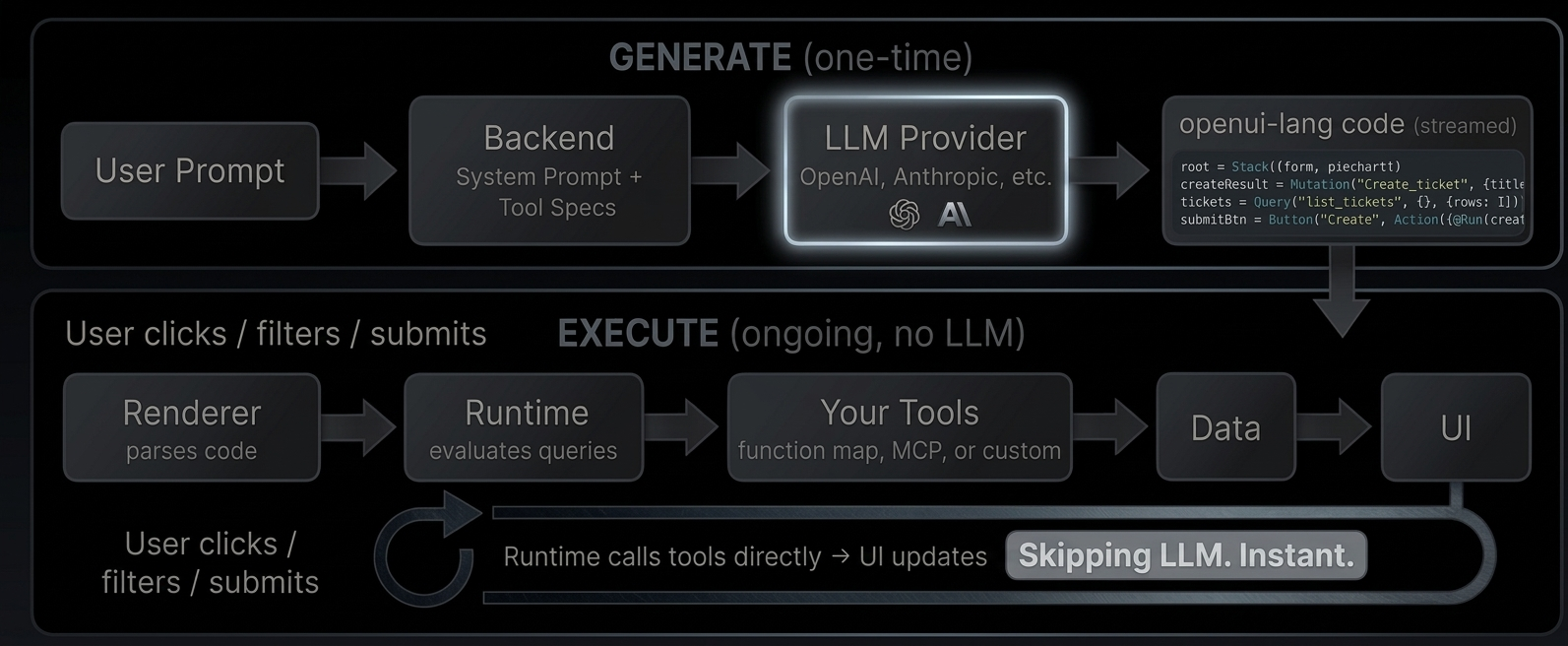
Generate [#generate]
The user describes what they want. Your backend sends the request to an LLM along with a system prompt that includes your component library and tool descriptions. The LLM responds with openui-lang code, a compact declarative format that describes the UI layout, data sources, and interactions.
Execute [#execute]
The Renderer parses the generated code. When it encounters a `Query("list_tickets")`, the runtime calls your tool directly, no LLM roundtrip. When the user clicks a button that triggers `@Run(createResult)`, the runtime executes the mutation against your tool. When a `$variable` changes from a dropdown, all dependent queries re-fetch automatically.
The LLM generated the wiring. The runtime executes it.
What this enables [#what-this-enables]
* **Reactive dashboards** with date range filters, auto-refresh, and live KPIs computed from query results
* **CRUD interfaces** with create forms, edit modals, tables with search and sort
* **Monitoring tools** with periodic refresh, server health metrics, and error rate tracking
* **Any tool-connected UI.** If you can expose it as a tool (via [MCP](https://modelcontextprotocol.io/docs/getting-started/intro) or function map), the LLM can wire it into a UI
Try it live: [Open the GitHub Demo](/demo/github)
Iterate and refine [#iterate-and-refine]
The LLM doesn't have to get it right the first time. With [incremental editing](/docs/openui-lang/incremental-editing), the user says "add a pie chart" and the LLM outputs only the 2-3 changed statements and the parser merges them into the existing code. Existing queries, state, and bindings stay intact.
```
Turn 1: Turn 2 (patch only):
root = Stack([header, tbl]) root = Stack([header, chart, tbl]) ← updated
header = CardHeader("Tickets") chart = PieChart(["Open","Closed"], ← new
tickets = Query(...) [@Count(@Filter(..., "open")),
tbl = Table([...]) @Count(@Filter(..., "closed"))
], "donut")
20 lines, ~400 tokens 3 lines, ~60 tokens (85% fewer)
```
Connecting tools [#connecting-tools]
The Renderer accepts a `toolProvider` prop that tells the runtime how to call your tools. Two options:
**Function map**, a plain object of async functions:
```tsx
fetch("/api/tickets").then((r) => r.json()),
create_ticket: async (args) =>
fetch("/api/tickets", { method: "POST", body: JSON.stringify(args) }).then((r) => r.json()),
}}
response={code}
library={library}
/>
```
**[MCP](https://modelcontextprotocol.io/docs/getting-started/intro) client** for server-side tools:
```tsx
import { Client } from "@modelcontextprotocol/sdk/client/index.js";
import { StreamableHTTPClientTransport } from "@modelcontextprotocol/sdk/client/streamableHttp.js";
const client = new Client({ name: "my-app", version: "1.0.0" });
await client.connect(new StreamableHTTPClientTransport(new URL("/api/mcp")));
;
```
These examples are simplified for demonstration. In production, you'll need to handle authentication, error boundaries, and connection lifecycle.
The [GitHub Demo](/demo/github) uses a function map where tools run entirely client-side, calling the GitHub API directly from the browser. The [Dashboard example](https://github.com/thesysdev/openui/tree/main/examples/openui-dashboard) uses MCP with server-side tools.
A concrete example [#a-concrete-example]
Here's the full flow for a ticket tracker: define tools, generate the prompt, render the output.
1. Define your tools [#1-define-your-tools]
```ts
// tools.ts
const tools: ToolSpec[] = [
{
name: "list_tickets",
description: "List all tickets",
inputSchema: { type: "object", properties: {} },
outputSchema: {
type: "object",
properties: {
rows: {
type: "array",
items: {
type: "object",
properties: { title: { type: "string" }, priority: { type: "string" } },
},
},
},
},
},
{
name: "create_ticket",
description: "Create a new ticket",
inputSchema: {
type: "object",
properties: {
title: { type: "string" },
priority: { type: "string" },
},
},
outputSchema: { type: "object", properties: { success: { type: "boolean" } } },
},
];
```
2. Generate the prompt and call the LLM [#2-generate-the-prompt-and-call-the-llm]
```ts
// route.ts
import { generatePrompt } from "@openuidev/lang-core";
import componentSpec from "./generated/component-spec.json";
const systemPrompt = generatePrompt({
...componentSpec,
tools,
toolCalls: true,
bindings: true,
});
const completion = await openai.chat.completions.create({
model: "gpt-5.4-mini",
stream: true,
messages: [
{ role: "system", content: systemPrompt },
{ role: "user", content: "Build a ticket tracker with a create form and table" },
],
});
```
3. Render the response [#3-render-the-response]
```tsx
// page.tsx
db.query("SELECT * FROM tickets"),
create_ticket: async (args) => db.query("INSERT INTO tickets ...", args),
}}
/>
```
What the LLM generates [#what-the-llm-generates]
```text
$title = ""
$priority = "medium"
createResult = Mutation("create_ticket", {title: $title, priority: $priority})
tickets = Query("list_tickets", {}, {rows: []})
submitBtn = Button("Create", Action([@Run(createResult), @Run(tickets), @Reset($title, $priority)]))
form = Form("create", submitBtn, [
FormControl("Title", Input("title", $title)),
FormControl("Priority", Select("priority", $priority, [
SelectItem("low", "Low"), SelectItem("medium", "Medium"), SelectItem("high", "High")
]))
])
tbl = Table([Col("Title", tickets.rows.title), Col("Priority", tickets.rows.priority)])
root = Stack([CardHeader("Ticket Tracker"), form, tbl])
```
What happens at runtime [#what-happens-at-runtime]
1. `Query("list_tickets")` → runtime calls your tool → table fills with data
2. User types a title, picks a priority, clicks "Create"
3. `@Run(createResult)` → runtime calls `create_ticket` directly
4. `@Run(tickets)` → runtime re-fetches `list_tickets` → table updates
5. `@Reset($title, $priority)` → form clears
All without the LLM.
# Incremental Editing
When a user says "add a pie chart" to an existing dashboard, the LLM doesn't regenerate everything.
It outputs only the changed and new statements. The parser merges them into the existing code.
How it works [#how-it-works]
```
Before (4 statements): After merge (5 statements):
root = Stack([header, tbl]) root = Stack([header, chart, tbl]) ← replaced
header = CardHeader("Tickets") header = CardHeader("Tickets") ← kept
tickets = Query("list_tickets",...) tickets = Query("list_tickets",...) ← kept
tbl = Table([...]) tbl = Table([...]) ← kept
chart = PieChart(...) ← added
LLM only output 2 lines (root + chart). Parser merged by name.
```
**Initial generation** - LLM outputs full code:
```text
root = Stack([header, tbl])
header = CardHeader("Tickets")
tickets = Query("list_tickets", {}, {rows: []})
tbl = Table([Col("Title", tickets.rows.title), Col("Status", tickets.rows.status)])
```
**User says:** *"add a pie chart showing ticket status breakdown"*
**LLM outputs only the patch:**
```text
root = Stack([header, chart, tbl])
chart = PieChart(["Open", "Closed"], [
@Count(@Filter(tickets.rows, "status", "==", "open")),
@Count(@Filter(tickets.rows, "status", "==", "closed"))
], "donut")
```
The parser merges by statement name:
* `root` is redefined → new definition wins (now includes `chart`)
* `chart` is new → added
* `header`, `tickets`, `tbl` → kept from original (not in the patch, so unchanged)
Merge rules [#merge-rules]
* **Same name** → new definition replaces old
* **New name** → added to the program
* **Missing from patch** → kept from original (not deleted)
* **Explicit deletion** → remove a statement from the `root` children list, it becomes unreachable and gets garbage-collected
Why this matters [#why-this-matters]
* **Fewer tokens** - LLM outputs 2-3 lines instead of regenerating 20+
* **Faster** - less to stream, less to parse
* **Preserves context** - existing queries, state, and bindings stay intact
* **Works with streaming** - each patched line renders as it arrives
Full regeneration: 20 statements, \~400 tokens, \~2s streaming.
Incremental patch: 2 statements, \~60 tokens, \~0.3s streaming.
Same result, up to **85% fewer tokens**.
Enabling edit mode [#enabling-edit-mode]
Two flags control this behavior in your prompt config:
```ts
const config: PromptSpec = {
...componentSpec,
editMode: true, // LLM outputs patches instead of full regenerations
inlineMode: true, // LLM can mix text and code in the same response
};
```
**`editMode`** tells the LLM it can output partial patches. Without it, the LLM regenerates the entire UI on every turn, even for small changes. With it enabled, the LLM only outputs the statements that changed or were added.
**`inlineMode`** lets the LLM respond with explanation text alongside the code. The parser extracts code from fenced blocks (` ```openui-lang `) and ignores everything else. This way the LLM can say "I added a pie chart for the status breakdown" before the patch, which gives the user context about what changed.
Both flags are passed to `generatePrompt()` via your `PromptSpec`. See [System Prompts](/docs/openui-lang/system-prompts) for the full reference.
# Introduction
import { StreamingComparison } from "@/app/docs/openui-lang/streaming-comparison";
import { TryItOut } from "./components/try-it-out";
OpenUI is a full-stack Generative UI framework (a compact streaming-first language, a React runtime with built-in component libraries, and ready-to-use chat interfaces) that is up to **[67% more token-efficient](/docs/openui-lang/benchmarks)** than JSON. Generate anything from rich chat responses to [fully interactive dashboards](/docs/openui-lang/how-it-works).
What is Generative UI? [#what-is-generative-ui]
Most AI applications are limited to returning text (as markdown) or rendering pre-built UI responses. Markdown isn't interactive, and pre-built responses are rigid (they don't adapt to the context of the conversation).
Generative UI fundamentally changes this relationship. Instead of merely providing content, the AI composes the interface itself. It dynamically selects, configures, and composes components from a predefined library to create a purpose-built interface tailored to the user's immediate request, be it an interactive chart, a complex form, or a multi-tab dashboard.
Architecture at a Glance [#architecture-at-a-glance]
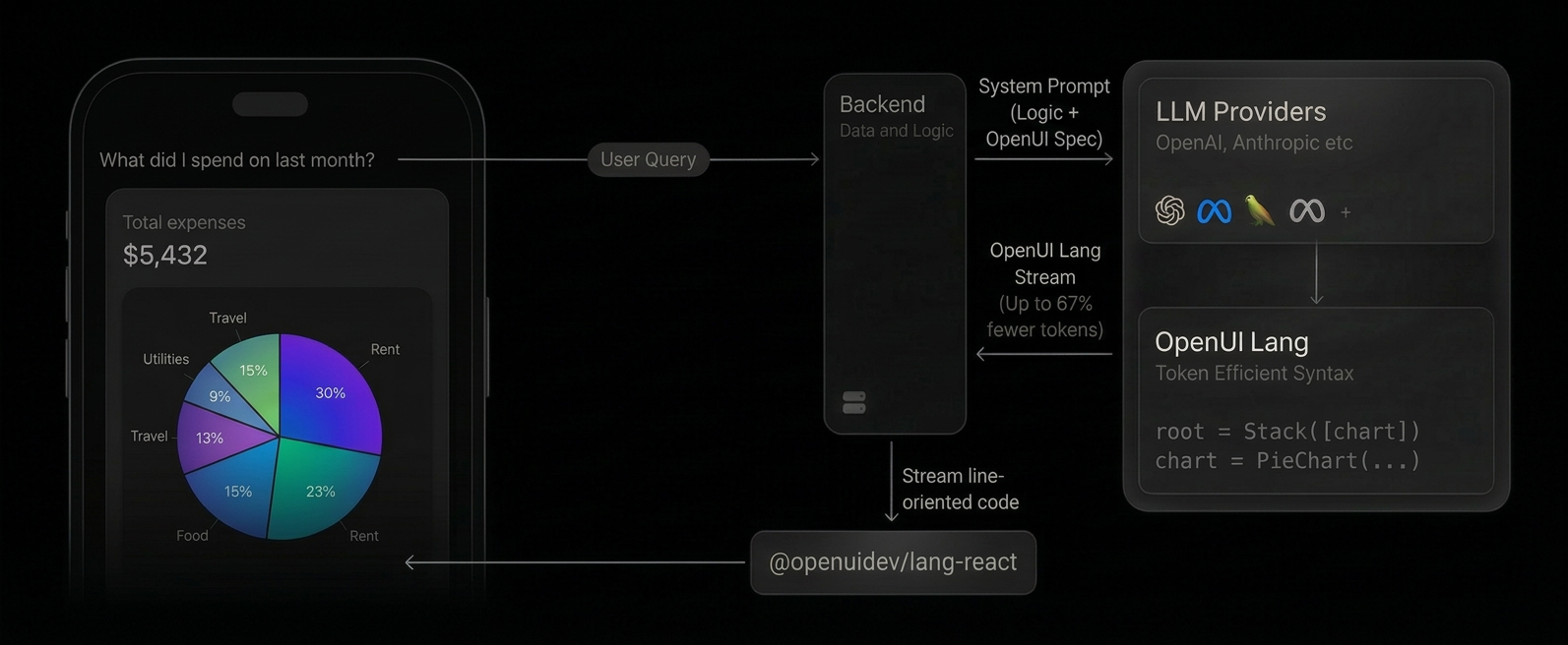
1. **System prompt includes OpenUI Lang spec**: Your backend appends the generated component library prompt alongside your system prompt, instructing the LLM to respond in OpenUI Lang instead of plain text or JSON.
2. **LLM generates OpenUI Lang**: Instead of returning markdown, the model outputs a compact, line-oriented syntax (e.g., `root = Stack([chart])`) constrained to your component library.
3. **Streaming render**: On the client, the `` component parses each line as it arrives and maps it to your React components in real-time. Structure renders first, then data fills in progressively.
The result is a native UI dynamically composed by the AI, streamed efficiently, and rendered safely from your own components. For data-driven apps with live tools and reactive state, see [Architecture](/docs/openui-lang/how-it-works).
OpenUI Lang [#openui-lang]
OpenUI Lang is a compact, line-oriented language designed specifically for Large Language Models (LLMs) to generate user interfaces. It serves as a more efficient, predictable, and stream-friendly alternative to verbose formats like JSON. For the complete syntax reference, see the [Language Specification](/docs/openui-lang/specification-v05).
Why a New Language? [#why-a-new-language]
While JSON is a common data interchange format, it has significant drawbacks when streamed directly from an LLM for UI generation. And there are multiple implementations around it, like Vercel [JSON-Render](https://json-render.dev/) and [A2UI](https://a2ui.org/).
OpenUI Lang was created to solve these core issues:
* **Token Efficiency:** JSON is extremely verbose. Keys like `"component"`, `"props"`, and `"children"` are repeated for every single element, consuming a large number of tokens. This directly increases API costs and latency. OpenUI Lang uses a concise, positional syntax that drastically reduces the token count. Benchmarks show it is up to **[67% more token-efficient](/docs/openui-lang/benchmarks)** than JSON.
* **Streaming-First Design:** The language is line-oriented (`identifier = Expression`), making it trivial to parse and render progressively. As each line arrives from the model, a new piece of the UI can be rendered immediately. This provides a superior user experience with much better perceived performance compared to waiting for a complete JSON object to download and parse.
* **Robustness:** LLMs are unpredictable. They can hallucinate component names or produce invalid structures. OpenUI Lang validates output and drops invalid portions, rendering only what's valid.
What can you build? [#what-can-you-build]
Conversational AI with generative UI responses, thread history, and prebuilt layouts.
Data-driven dashboards, CRUD interfaces, and monitoring tools, powered by live data from your
tools.
Want to try it? [Open the Playground](/playground) or follow the [Quick Start](/docs/openui-lang/quickstart).
# Interactivity
OpenUI components can be interactive. The `Renderer` manages form state automatically and exposes callbacks for actions and persistence.
Actions [#actions]
When a user clicks a button or follow-up, the component calls `triggerAction`. The `Renderer` wraps this into an `ActionEvent` and fires `onAction`.
```tsx
{
if (event.type === "continue_conversation") {
// event.humanFriendlyMessage — button label or follow-up text
// event.formState — field values at time of click
// event.formName — scoping form name, if any
}
}}
/>
```
ActionEvent [#actionevent]
| Field | Type | Description |
| :--------------------- | :--------------------------------- | :-------------------------------------- |
| `type` | `string` | Action type (see built-in types below). |
| `params` | `Record` | Extra parameters from the component. |
| `humanFriendlyMessage` | `string` | Display label for the action. |
| `formState` | `Record \| undefined` | Raw field state at time of action. |
| `formName` | `string \| undefined` | Form that scoped the action, if any. |
Built-in action types [#built-in-action-types]
```ts
// Dispatched via onAction callback
enum BuiltinActionType {
ContinueConversation = "continue_conversation",
OpenUrl = "open_url",
}
```
* `ContinueConversation`: sends the user's intent back to the LLM (`@ToAssistant`).
* `OpenUrl`: opens a URL in a new tab (`@OpenUrl`).
The following action steps are handled internally by the runtime (not dispatched to `onAction`):
* `@Run(ref)`: executes a Mutation or re-fetches a Query
* `@Set($var, value)`: changes a reactive `$variable`
* `@Reset($var1, $var2)`: restores `$variables` to their declared defaults
In openui-lang, actions are composed with `Action([...])`:
```text
submitBtn = Button("Create", Action([@Run(createResult), @Run(tickets), @Reset($title)]))
```
See [Reactive State](/docs/openui-lang/reactive-state) for `$variables` and [Queries & Mutations](/docs/openui-lang/queries-mutations) for `@Run`.
Inline mode [#inline-mode]
When `inlineMode` is enabled in the prompt config, the LLM can respond with either:
* **Code** (fenced in triple backticks), for creating or changing the UI
* **Text only**, for answering questions without modifying the UI
The parser extracts code from fences automatically. Text outside fences is shown as chat.
Using triggerAction in components [#using-triggeraction-in-components]
Inside `defineComponent`, use the `useTriggerAction` hook:
```tsx
const MyButton = defineComponent({
name: "MyButton",
description: "A clickable button.",
props: z.object({ label: z.string() }),
component: ({ props }) => {
const triggerAction = useTriggerAction();
return ;
},
});
```
`triggerAction(userMessage, formName?, action?)` accepts optional second and third arguments.
***
Reactive state ($variables) [#reactive-state-variables]
In openui-lang, `$variables` create reactive state that components can read and write. When the LLM generates `$days = "7"` and passes it to a Select, the runtime creates a two-way binding automatically.
For component authors building custom libraries, the `useStateField` hook provides this binding:
```tsx
import { useStateField, reactive } from "@openuidev/react-lang";
const MySelect = defineComponent({
name: "MySelect",
props: z.object({
name: z.string(),
value: reactive(z.string().optional()), // reactive() marks this prop as accepting $variable binding
items: z.array(SelectItem.ref),
}),
component: ({ props }) => {
const field = useStateField(props.name, props.value);
// field.value — current value (reads from $variable or form state)
// field.setValue(val) — updates the $variable and triggers re-evaluation
return (
);
},
});
```
`useStateField` unifies form state and reactive `$variable` binding. When the prop is a `$variable`, `setValue` updates the store and triggers all dependent queries and expressions to re-evaluate.
See [Reactive State](/docs/openui-lang/reactive-state) for the language-level documentation.
***
Form state [#form-state]
The `Renderer` tracks field values automatically. Components use `useStateField` (preferred) or the lower-level `useSetFieldValue` and `useGetFieldValue` to read and write state.
Persistence [#persistence]
Use `onStateUpdate` to persist field state (e.g. to a message in your thread store) and `initialState` to hydrate it on load.
```tsx
{
// state is a raw Record of all field values
saveToBackend(state);
}}
initialState={loadedState}
/>
```
`onStateUpdate` fires on every field change. The state format is opaque, so persist and hydrate it as-is.
Field hooks [#field-hooks]
Use these inside `defineComponent` renderers:
| Hook | Signature | Description |
| :------------------- | :------------------------------------------------------------------------------------------------------------------------------------------- | :---------------------------------------------------------------- |
| `useStateField` | `(name: string, value?: unknown) => { value: unknown, setValue: (v: unknown) => void }` | **Preferred.** Unified form state + reactive `$variable` binding. |
| `useGetFieldValue` | `(formName: string \| undefined, name: string) => any` | Read a field's current value. |
| `useSetFieldValue` | `(formName: string \| undefined, componentType: string \| undefined, name: string, value: any, shouldTriggerSaveCallback?: boolean) => void` | Write a field value. |
| `useFormName` | `() => string \| undefined` | Get the enclosing form's name. |
| `useSetDefaultValue` | `(options: { formName?, componentType, name, existingValue, defaultValue, shouldTriggerSaveCallback? }) => void` | Set a default if no value exists. |
***
Validation [#validation]
Form fields can declare validation rules. The `Form` component provides a validation context via `useFormValidation`.
```ts
interface FormValidationContextValue {
errors: Record;
validateField: (name: string, value: unknown, rules: ParsedRule[]) => boolean;
registerField: (name: string, rules: ParsedRule[], getValue: () => unknown) => void;
unregisterField: (name: string) => void;
validateForm: () => boolean;
clearFieldError: (name: string) => void;
}
```
Built-in validators include `required`, `minLength`, `maxLength`, `min`, `max`, `pattern`, and `email`. Custom validators can be added via `builtInValidators`.
***
# Overview
import { LangExample } from "./components/lang-example";
OpenUI is built around four core building blocks that work together to turn LLM output into rendered UI:
* **Library**: A collection of components defined with Zod schemas and React renderers. The library is the contract between your app and the AI, defining what components the LLM can use and how they render.
* **Prompt Generator**: Converts your library into a system prompt that instructs the LLM to output valid OpenUI Lang. Includes syntax rules, component signatures, streaming guidelines, and your custom examples/rules.
* **Parser**: Parses OpenUI Lang text (line-by-line, streaming-compatible) into a typed element tree. Validates against your library's JSON Schema and gracefully handles partial/invalid output.
* **Renderer**: The `` React component takes parsed output and maps each element to your library's React components, rendering the UI progressively as the stream arrives.
Built-in Component Libraries [#built-in-component-libraries]
OpenUI ships with two ready-to-use libraries via `@openuidev/react-ui`. Both include layouts, content blocks, charts, forms, tables, and more.
General-purpose library (openuiLibrary) [#general-purpose-library-openuilibrary]
Root component is `Stack`. Includes the full component suite with flexible layout primitives. Use this for standalone rendering, playgrounds, and non-chat interfaces.
```ts
import { openuiLibrary, openuiPromptOptions } from "@openuidev/react-ui/genui-lib";
import { Renderer } from "@openuidev/react-lang";
// Generate system prompt
const systemPrompt = openuiLibrary.prompt(openuiPromptOptions);
// Render streamed output
```
Chat-optimized library (openuiChatLibrary) [#chat-optimized-library-openuichatlibrary]
Root component is `Card` (vertical container, no layout params). Adds chat-specific components like `FollowUpBlock`, `ListBlock`, and `SectionBlock`. Does not include `Stack`; responses are always single-card, vertically stacked.
```ts
import { openuiChatLibrary, openuiChatPromptOptions } from "@openuidev/react-ui/genui-lib";
import { FullScreen } from "@openuidev/react-ui";
// Use with a chat layout
```
Both libraries expose a `.prompt()` method to generate the system prompt your LLM needs. See [System Prompts](/docs/openui-lang/system-prompts) for CLI and programmatic generation options.
Extend a built-in library [#extend-a-built-in-library]
```ts
import { createLibrary, defineComponent } from "@openuidev/react-lang";
import { openuiLibrary } from "@openuidev/react-ui/genui-lib";
import { z } from "zod";
const ProductCard = defineComponent({
name: "ProductCard",
description: "Product tile",
props: z.object({
name: z.string(),
price: z.number(),
}),
component: ({ props }) =>
{props.name}: ${props.price}
,
});
const myLibrary = createLibrary({
root: openuiLibrary.root ?? "Stack",
componentGroups: openuiLibrary.componentGroups,
components: [...Object.values(openuiLibrary.components), ProductCard],
});
```
Usage Example [#usage-example]
# Patterns
Real dashboards combine multiple features. These patterns show complete, copy-paste-ready openui-lang snippets using the built-in `openuiLibrary` components (Stack, Card, Table, etc.). The openui-lang code works the same with any custom library, just swap the component names to match your own definitions.
Searchable, sortable table [#searchable-sortable-table]
A text input filters rows, a dropdown sorts them. Both are reactive.
```text
$search = ""
$sortBy = "stars"
data = Query("get_repos", {}, {rows: []})
filtered = @Filter(data.rows, "name", "contains", $search)
sorted = @Sort(filtered, $sortBy, "desc")
searchBox = FormControl("Search", Input("search", "Filter repos...", "text", null, $search))
sortSelect = FormControl("Sort by", Select("sortBy", [SelectItem("stars", "Stars"), SelectItem("forks", "Forks"), SelectItem("updated", "Recent")], null, null, $sortBy))
controls = Stack([searchBox, sortSelect], "row", "m")
tbl = Table([Col("Name", sorted.name), Col("Stars", sorted.stars, "number"), Col("Forks", sorted.forks, "number")])
emptyState = @Count(filtered) > 0 ? tbl : TextContent("No results match your search.")
root = Stack([CardHeader("Repositories"), controls, emptyState])
```
What's happening:
* `$search` binds to the Input. User types, `@Filter` re-evaluates, table updates.
* `$sortBy` binds to the Select. User picks a field, `@Sort` re-evaluates.
* `@Count(filtered) > 0` shows an empty state when nothing matches.
CRUD with edit modal [#crud-with-edit-modal]
Create tickets with a form, edit them in a modal, refresh the table after each action.
```text
$title = ""
$priority = "medium"
$showEdit = false
$editId = ""
$editTitle = ""
$editPriority = "medium"
createResult = Mutation("create_ticket", {title: $title, priority: $priority})
updateResult = Mutation("update_ticket", {id: $editId, title: $editTitle, priority: $editPriority})
tickets = Query("list_tickets", {}, {rows: []})
createBtn = Button("Create", Action([@Run(createResult), @Run(tickets), @Reset($title, $priority)]))
createForm = Form("create", createBtn, [
FormControl("Title", Input("title", "Ticket title", "text", {required: true}, $title)),
FormControl("Priority", Select("priority", [SelectItem("low", "Low"), SelectItem("medium", "Medium"), SelectItem("high", "High")], null, null, $priority))
])
tbl = Table([
Col("Title", tickets.rows.title),
Col("Priority", @Each(tickets.rows, "t", Tag(t.priority, null, "sm", t.priority == "high" ? "danger" : "neutral"))),
Col("Edit", @Each(tickets.rows, "t", Button("Edit", Action([@Set($editId, t.id), @Set($editTitle, t.title), @Set($editPriority, t.priority), @Set($showEdit, true)]), "secondary", "normal", "small")))
])
saveBtn = Button("Save", Action([@Run(updateResult), @Run(tickets), @Set($showEdit, false)]), "primary")
cancelBtn = Button("Cancel", Action([@Set($showEdit, false)]), "secondary")
editForm = Form("edit", Buttons([saveBtn, cancelBtn]), [
FormControl("Title", Input("editTitle", "", "text", {required: true}, $editTitle)),
FormControl("Priority", Select("editPriority", [SelectItem("low", "Low"), SelectItem("medium", "Medium"), SelectItem("high", "High")], null, null, $editPriority))
])
editModal = Modal("Edit Ticket", $showEdit, [editForm])
root = Stack([CardHeader("Tickets"), createForm, tbl, editModal])
```
What's happening:
* Create form uses `Mutation` + `@Run` + `@Reset` to create and clear.
* Edit button uses `@Set` to populate modal fields and open it.
* Save button runs the update mutation, refreshes the query, and closes the modal.
* `@Each` renders per-row Tag colors and Edit buttons.
Dashboard with KPI cards [#dashboard-with-kpi-cards]
Aggregate query results into KPI cards using `@Count`, `@Sum`, and `@Filter`.
```text
$days = "7"
data = Query("get_usage_metrics", {days: $days}, {totalEvents: 0, totalUsers: 0, data: []})
filter = FormControl("Date Range", Select("days", [SelectItem("7", "7 days"), SelectItem("14", "14 days"), SelectItem("30", "30 days")], null, null, $days))
kpiRow = Stack([
Card([TextContent("Events", "small"), TextContent("" + data.totalEvents, "large-heavy")]),
Card([TextContent("Users", "small"), TextContent("" + data.totalUsers, "large-heavy")]),
Card([TextContent("Avg/Day", "small"), TextContent("" + @Round(@Avg(data.data.events), 0), "large-heavy")])
], "row", "m", "stretch", "start", true)
chart = Card([CardHeader("Daily Trend"), LineChart(data.data.day, [Series("Events", data.data.events), Series("Users", data.data.users)])])
root = Stack([CardHeader("Analytics"), filter, kpiRow, chart])
```
What's happening:
* One `$days` variable drives the Query args. Changing the Select re-fetches everything.
* KPIs use direct field access (`data.totalEvents`) and computed values (`@Round(@Avg(...))`).
* The chart uses array pluck (`data.data.day`) to extract columns from the query result.
Auto-refresh monitoring [#auto-refresh-monitoring]
The 4th argument to `Query` sets a refresh interval in seconds.
```text
health = Query("get_server_health", {}, {cpu: 0, memory: 0, latencyP95: 0, errorRate: 0, timeseries: []}, 30)
kpiRow = Stack([
Card([TextContent("CPU", "small"), TextContent("" + @Round(health.cpu, 1) + "%", "large-heavy")]),
Card([TextContent("Memory", "small"), TextContent("" + @Round(health.memory, 1) + "%", "large-heavy")]),
Card([TextContent("P95 Latency", "small"), TextContent("" + health.latencyP95 + "ms", "large-heavy")]),
Card([TextContent("Error Rate", "small"), TextContent("" + @Round(health.errorRate, 2) + "%", "large-heavy")])
], "row", "m", "stretch", "start", true)
chart = Card([CardHeader("24h Trend"), LineChart(health.timeseries.time, [Series("CPU", health.timeseries.cpu), Series("Memory", health.timeseries.memory)])])
refreshBtn = Button("Refresh Now", Action([@Run(health)]), "secondary")
root = Stack([CardHeader("Server Health"), refreshBtn, kpiRow, chart])
```
What's happening:
* `Query(..., 30)` re-fetches every 30 seconds automatically.
* `@Run(health)` on the button triggers an immediate manual refresh.
* KPIs use `@Round` for clean number formatting.
Shared filter across tabs [#shared-filter-across-tabs]
One `$days` variable works across all tab content because tabs share the same reactive scope.
```text
$days = "7"
filter = FormControl("Date Range", Select("days", [SelectItem("7", "7 days"), SelectItem("14", "14 days"), SelectItem("30", "30 days")], null, null, $days))
usage = Query("get_usage_metrics", {days: $days}, {data: []})
endpoints = Query("get_top_endpoints", {days: $days}, {endpoints: []})
overviewTab = TabItem("overview", "Overview", [
LineChart(usage.data.day, [Series("Events", usage.data.events)])
])
endpointsTab = TabItem("endpoints", "Top Endpoints", [
Table([Col("Path", endpoints.endpoints.path), Col("Requests", endpoints.endpoints.requests, "number"), Col("Latency", endpoints.endpoints.avgLatency, "number")])
])
tabs = Tabs([overviewTab, endpointsTab])
root = Stack([CardHeader("Dashboard"), filter, tabs])
```
What's happening:
* Both `usage` and `endpoints` queries reference `$days` in their args.
* Changing the filter re-fetches both queries, updating both tabs.
* Each tab renders different data but shares the same reactive variable.
# Prompts
This page is maintained for older links.
The canonical prompt documentation is:
* [System Prompts](/docs/openui-lang/system-prompts)
Quick example:
```ts
import { openuiLibrary, openuiPromptOptions } from "@openuidev/react-ui";
const systemPrompt = openuiLibrary.prompt(openuiPromptOptions);
```
Prompt generation behavior is documented in detail on the System Prompts page.
# Queries & Mutations
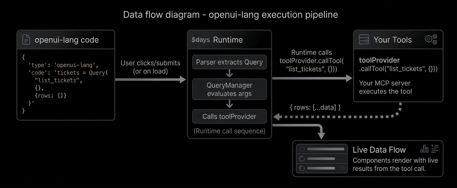
OpenUI Lang connects to your backend through **tools**. A tool is any function your server
exposes (a database query, an API call, a calculation). The LLM generates `Query` and `Mutation`
statements that call these tools. The runtime executes them directly and feeds the results into your UI.
Reading data with Query [#reading-data-with-query]
```text
data = Query("list_tickets", {}, {rows: []})
```
What each argument means:
1. `"list_tickets"` - the tool name (matches what your server exposes)
2. `{}` - arguments to pass to the tool
3. `{rows: []}` - default value (what renders before the tool responds)
The default value is important - it lets the UI render immediately while data loads.
Using Query results [#using-query-results]
Query results are just data. Access fields with dot notation:
```text
tbl = Table([Col("Title", data.rows.title), Col("Status", data.rows.status)])
chart = LineChart(data.rows.day, [Series("Views", data.rows.views)])
```
`data.rows.title` extracts the `title` field from every row - like a column pluck.
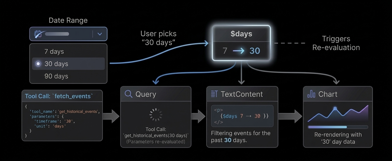
Reactive queries [#reactive-queries]
Pass a `$variable` in the query args - the query re-runs when the variable changes:
```text
$days = "7"
data = Query("analytics", {days: $days}, {rows: []})
filter = Select("days", $days, [SelectItem("7", "7 days"), SelectItem("30", "30 days")])
```
User picks "30" → `$days` updates → Query re-fetches with `{days: "30"}` → chart updates.
Auto-refresh [#auto-refresh]
Add a fourth argument for periodic refresh (in seconds):
```text
health = Query("get_server_health", {}, {cpu: 0, memory: 0}, 30)
```
This re-fetches every 30 seconds - great for monitoring dashboards.
Writing data with Mutation [#writing-data-with-mutation]
```text
createResult = Mutation("create_ticket", {title: $title, priority: $priority})
```
Mutations are NOT executed on page load. They only run when triggered by `@Run`:
```text
submitBtn = Button("Create", Action([@Run(createResult), @Run(tickets), @Reset($title)]))
```
This button does three things in order:
1. `@Run(createResult)` - executes the mutation (creates the ticket)
2. `@Run(tickets)` - re-fetches the tickets query (refreshes the table)
3. `@Reset($title)` - clears the form
Error handling [#error-handling]
Check `result.status` for mutation feedback:
```text
createResult.status == "error" ? Callout("error", "Failed", createResult.error) : null
createResult.status == "success" ? Callout("success", "Created", "Ticket added.") : null
```
How tools connect to the runtime [#how-tools-connect-to-the-runtime]
The Renderer accepts a `toolProvider` prop that handles tool execution. Pass a function map or an [MCP](https://modelcontextprotocol.io/docs/getting-started/intro) client:
```tsx
// Function map
fetch('/api/tickets').then(r => r.json()),
}} response={code} library={library} />
// Or an MCP client
```
# Quick Start
Create the app [#create-the-app]
```bash
npx @openuidev/cli@latest create --name genui-chat-app
cd genui-chat-app
```
Add your API key [#add-your-api-key]
The generated app uses OpenAI by default, but works with any OpenAI-compatible provider (e.g., OpenRouter, Azure OpenAI, Anthropic via proxy).
```bash
echo "OPENAI_API_KEY=sk-your-key-here" > .env
```
Start the dev server [#start-the-dev-server]
```bash
npm run dev
```
What's included [#whats-included]
The CLI generates a Next.js app with everything wired up:
```
src/
app/
page.tsx # FullScreen chat layout with the built-in component library
api/chat/
route.ts # Backend route with OpenAI streaming + example tools
library.ts # Re-exports openuiChatLibrary and openuiChatPromptOptions
generated/
system-prompt.txt # Auto-generated at build time via `openui generate`
```
* **`page.tsx`**: Renders the `FullScreen` chat layout with `openuiChatLibrary` for Generative UI rendering and `openAIAdapter()` for streaming.
* **`route.ts`**: A backend API route that sends the system prompt to the LLM and streams the response back.
* **`library.ts`**: Your component library entrypoint. The `openui generate` CLI reads this file to produce the system prompt.
The `dev` and `build` scripts automatically regenerate the system prompt before starting:
```json
"generate:prompt": "openui generate src/library.ts --out src/generated/system-prompt.txt",
"dev": "pnpm generate:prompt && next dev"
```
# Reactive State
Every UI needs state: which tab is selected, what the user typed, whether a modal is open.
In OpenUI Lang, state is declared with `$variables`.
Declaring a variable [#declaring-a-variable]
A `$variable` is a line that starts with `$`:
```text
$days = "7"
$title = ""
$showEdit = false
```
That's it. The value on the right is the default.
Binding to inputs [#binding-to-inputs]
When you pass a `$variable` to an input component, it creates a two-way binding.
The user changes the input, the variable updates. The variable changes, the input updates.
```text
$days = "7"
filter = Select("days", $days, [SelectItem("7", "7 days"), SelectItem("30", "30 days")])
```
Using variables in expressions [#using-variables-in-expressions]
Any expression can read a `$variable`:
```text
title = TextContent("Showing last " + $days + " days")
data = Query("analytics", {days: $days}, {rows: []})
```
When `$days` changes (user picks "30" in the Select), the title updates and the Query
re-fetches with the new value. This happens automatically - no wiring needed.
Changing state from buttons [#changing-state-from-buttons]
Use `@Set` inside an `Action` to change a variable when a button is clicked:
```text
btn = Button("Show 30 days", Action([@Set($days, "30")]))
```
You can set multiple variables at once:
```text
saveBtn = Button("Save", Action([@Set($showEdit, false), @Set($saved, true)]))
```
Resetting to defaults [#resetting-to-defaults]
`@Reset` restores variables to their declared defaults:
```text
$title = ""
$priority = "medium"
resetBtn = Button("Clear", Action([@Reset($title, $priority)]))
```
After click: `$title` goes back to `""`, `$priority` goes back to `"medium"`.
Conditional rendering [#conditional-rendering]
Use ternary expressions to show/hide UI based on state:
```text
$showEdit ? editForm : null
status == "error" ? Callout("error", "Failed", errorMsg) : null
```
How reactivity works [#how-reactivity-works]
When a `$variable` changes:
1. All inputs bound to it update their display
2. All `Query` calls that reference it in their args re-fetch
3. All expressions that reference it re-evaluate
4. The UI re-renders with new values
No event listeners. No useEffect. No wiring. Just declare and reference.
# The Renderer
`` converts OpenUI Lang text into React UI using your library.
Basic usage [#basic-usage]
```tsx
import { Renderer } from "@openuidev/react-lang";
import { openuiLibrary } from "@openuidev/react-ui";
export function AssistantMessage({
content,
isStreaming,
}: {
content: string | null;
isStreaming: boolean;
}) {
return ;
}
```
Props [#props]
| Prop | Type | Description |
| :-------------- | :--------------------------------------------------------------------------------------------- | :----------------------------------------------------------------------------------------------------------------------------------------------- |
| `response` | `string \| null` | Raw OpenUI Lang response text. |
| `library` | `Library` | Library created by `createLibrary(...)`. |
| `isStreaming` | `boolean` | Indicates stream is in progress. |
| `onAction` | `(event: ActionEvent) => void` | Receives structured action events from interactive components. |
| `onStateUpdate` | `(state: Record) => void` | Called on form field changes with the raw field state map. |
| `initialState` | `Record` | Hydrates form state on load (e.g. from persisted message). |
| `onParseResult` | `(result: ParseResult \| null) => void` | Debug/inspect latest parse result. |
| `toolProvider` | `Record) => Promise> \| McpClientLike \| null` | Handles `Query()` / `Mutation()` tool calls. Pass a function map or an [MCP](https://modelcontextprotocol.io/docs/getting-started/intro) client. |
| `queryLoader` | `React.ReactNode` | Custom loading indicator shown while queries are fetching. Defaults to a spinner. |
| `onError` | `(errors: OpenUIError[]) => void` | Structured, LLM-friendly errors from the parser and query system. Suitable for automated correction loops. Called with `[]` when resolved. |
Connecting tools [#connecting-tools]
For UIs that use `Query()` and `Mutation()`, pass a `toolProvider`. Two options:
```tsx
// Function map — tools are just async functions
fetch("/api/tickets").then((r) => r.json()),
create_ticket: async (args) =>
fetch("/api/tickets", { method: "POST", body: JSON.stringify(args) }).then((r) => r.json()),
}}
library={library}
response={code}
/>;
// MCP client — pass a configured MCP client directly
import { Client } from "@modelcontextprotocol/sdk/client/index.js";
import { StreamableHTTPClientTransport } from "@modelcontextprotocol/sdk/client/streamableHttp.js";
const client = new Client({ name: "my-app", version: "1.0.0" });
await client.connect(new StreamableHTTPClientTransport(new URL("/api/mcp")));
;
```
These examples are simplified for demonstration. In production, you'll need to handle authentication, error boundaries, and connection lifecycle.
Error handling [#error-handling]
`onError` receives structured errors suitable for sending back to the LLM for correction:
```tsx
{
if (!errors.length) return;
const msg = errors
.map(
(e) =>
`[${e.source}] ${e.statementId ? `"${e.statementId}": ` : ""}${e.message}${e.hint ? `\nHint: ${e.hint}` : ""}`,
)
.join("\n\n");
// Send back to LLM for self-correction
sendToLLM(`Fix these errors:\n\n${msg}`);
}}
/>
```
Error codes:
| Code | Source | Description |
| :------------------ | :------------- | :---------------------------------------------------------------------- |
| `unknown-component` | parser | Component name not in the library |
| `missing-required` | parser | Required prop not provided |
| `null-required` | parser | Required prop explicitly null |
| `excess-args` | parser | More positional args than schema params (extras dropped, still renders) |
| `inline-reserved` | parser | Query/Mutation used inline instead of top-level |
| `parse-failed` | parser | Response produced no renderable root |
| `parse-exception` | parser | Parser crashed on malformed input |
| `tool-not-found` | query/mutation | Tool name not found in toolProvider |
| `runtime-error` | runtime | Expression evaluation failed on a prop |
| `render-error` | runtime | React component threw during render |
If no `onError` callback is provided, errors are logged to `console.warn` instead of being silently swallowed.
Streaming behavior [#streaming-behavior]
* Parser re-runs as chunks arrive.
* Forward references resolve when their statements arrive.
* Unresolved references and invalid components are dropped from arrays (not left as null holes).
* `meta.orphaned` lists defined-but-unreachable statements on every chunk — useful for real-time debugging.
* There is no `nodePlaceholder` prop in the current renderer API.
Actions [#actions]
```tsx
{
if (event.type === "continue_conversation") {
// event.humanFriendlyMessage — display label
// event.formState — raw field values at time of action
}
}}
/>
```
Hooks for component authors [#hooks-for-component-authors]
Use these inside components defined with `defineComponent(...)`. See [Reactive State](/docs/openui-lang/reactive-state) for how `$variables` work in the language.
* `useStateField(name, value?)` - reactive `$variable` binding (preferred for inputs)
* `useIsStreaming()`
* `useTriggerAction()`
* `useRenderNode()`
* `useFormValidation()`
* `useFormName()` / `useGetFieldValue()` / `useSetFieldValue()`
In component renderers, `renderNode` is also passed directly as a prop.
Example with nested children [#example-with-nested-children]
```tsx
const Dashboard = defineComponent({
name: "Dashboard",
description: "Container",
props: z.object({ cards: z.array(StatCard.ref) }),
component: ({ props, renderNode }) =>
{renderNode(props.cards)}
,
});
```
# v0.1
This is the **v0.1** specification, the original language for generating static UI from LLM
output. For the latest version with reactive state, data queries, and interactive apps, see
[v0.5](/docs/openui-lang/specification-v05).
OpenUI Lang is the output format the LLM generates. It is a compact, declarative, line-oriented DSL designed specifically for streaming and token efficiency.
While you rarely write this language manually, understanding the syntax is helpful for debugging raw LLM outputs or building custom parsers.
Syntax Overview [#syntax-overview]
The language consists of a series of **assignment statements**. Every line binds a unique identifier to an expression.
```text
root = Root([header, chart]) // 1. Entry Point
header = Header("Q4 Revenue", "YTD") // 2. Component Call
chart = BarChart(labels, [s1, s2]) // 3. Forward Reference
labels = ["Jan", "Feb", "Mar"] // 4. Data Definition
s1 = Series("Product A", [10, 20, 30])
s2 = Series("Product B", [5, 15, 25])
```
Core Rules [#core-rules]
1. **One statement per line:** `identifier = Expression`
2. **Root Entry Point:** The first statement **must** assign to the identifier `root` (or call the Root component). If missing, nothing renders.
3. **Top-Down Generation:** Statements are generally written top-down (Layout -> Components -> Data) to maximize perceived performance during streaming.
4. **Positional Arguments:** Arguments are mapped to component props by position, defined by the order of keys in your Zod schema.
***
Expressions & Types [#expressions--types]
OpenUI Lang supports a strict subset of JavaScript values.
| Type | Syntax | Example |
| :----------------- | :------------------ | :---------------------------- |
| **Component Call** | `Type(arg1, arg2)` | `Header("Title", "Subtitle")` |
| **String** | `"text"` | `"Hello world"` |
| **Number** | `123`, `12.5`, `-5` | `42` |
| **Boolean** | `true` / `false` | `true` |
| **Null** | `null` | `null` |
| **Array** | `[a, b, c]` | `["Jan", "Feb", "Mar"]` |
| **Object** | `{key: val}` | `{variant: "info", id: 1}` |
| **Reference** | `identifier` | `myTableData` |
***
Component Resolution [#component-resolution]
The parser maps **Positional Arguments** in OpenUI Lang to **Named Props** in React using your Zod definitions.
The Mapping Logic [#the-mapping-logic]
The order of keys in your `z.object` schema defines the expected argument order.
**1. The Schema (Zod)**
```typescript
const HeaderSchema = z.object({
title: z.string(), // Position 0
subtitle: z.string().optional(), // Position 1
});
```
**2. The Output (OpenUI Lang)**
```text
h1 = Header("Dashboard", "Overview")
```
**3. The Result (React Props)**
```json
{
"title": "Dashboard",
"subtitle": "Overview"
}
```
Critical implications for component design [#critical-implications-for-component-design]
* **Key order in z.object is the API contract.** Changing key order breaks all existing LLM outputs.
* **Required props must come before optional props** in the schema, since trailing optional args can be omitted.
* **The LLM learns positions from the auto-generated system prompt.** If the prompt and schema disagree (e.g., after a schema change without regenerating the prompt), output will be garbled.
Optional Arguments [#optional-arguments]
Optional arguments (trailing) can be omitted.
```text
// Valid: subtitle is undefined
h1 = Header("Dashboard")
```
***
Streaming & Hoisting [#streaming--hoisting]
OpenUI Lang allows **Forward References** (Hoisting). An identifier can be used as an argument *before* it is defined in the stream. This is critical for progressive rendering.
How it works [#how-it-works]
```text
root = Root([table]) // "table" is referenced here...
// ... (network latency) ...
table = Table(rows) // ...but defined here.
```
1. **Step 1:** The renderer parses `root`. It sees `table` is undefined. It renders a **Skeleton/Placeholder** for the table.
2. **Step 2:** The `table` definition arrives. The renderer updates the React tree, replacing the skeleton with the actual `Table` component.
3. **Step 3:** `rows` arrives → Table fills in with data.
Complete Syntax Example [#complete-syntax-example]
A complex example showing nesting, arrays, and mixed types.
```text
root = Root([nav, dashboard])
nav = Navbar("Acme Corp", [link1, link2])
link1 = Link("Home", "/")
link2 = Link("Settings", "/settings")
dashboard = Section([kpi_row, main_chart])
kpi_row = Grid([stat1, stat2])
stat1 = StatCard("Revenue", "$1.2M", "up")
stat2 = StatCard("Users", "450k", "flat")
main_chart = LineChart(
["Mon", "Tue", "Wed"],
[Series("Visits", [100, 450, 320])]
)
```
# v0.5 (Latest)
OpenUI Lang v0.5 extends the [v0.1 specification](/docs/openui-lang/specification-v01) with reactive state, data fetching, and built-in functions. See the [Evolution Guide](/docs/openui-lang/evolution-guide) to understand how the language evolved from static UI generation to interactive apps.
Syntax Overview [#syntax-overview]
The language consists of **assignment statements** - one per line.
```text
identifier = Expression
```
Three types of statements:
| Statement | Syntax | Example |
| ----------------- | -------------------------------------------- | -------------------------------------- |
| Component | `name = Component(args...)` | `header = CardHeader("Title")` |
| State declaration | `$name = defaultValue` | `$days = "7"` |
| Data statement | `name = Query(...)` / `name = Mutation(...)` | `data = Query("tool", {}, {rows: []})` |
Expressions & Types [#expressions--types]
| Type | Syntax | Example |
| -------------- | ------------------- | ----------------------------- |
| Component call | `Type(arg1, arg2)` | `Header("Title", "Subtitle")` |
| Built-in call | `@Name(args)` | `@Count(data.rows)` |
| String | `"text"` | `"Hello"` |
| Number | `123`, `12.5`, `-5` | `42` |
| Boolean | `true` / `false` | `true` |
| Null | `null` | `null` |
| Array | `[a, b, c]` | `["Jan", "Feb"]` |
| Object | `{key: val}` | `{sql: "SELECT *"}` |
| Reference | `identifier` | `myHeader` |
| State ref | `$identifier` | `$days` |
| Member access | `a.b.c` | `data.rows.title` |
| Ternary | `cond ? a : b` | `$show ? form : null` |
| Binary ops | `a + b`, `a == b` | `"" + $days + " days"` |
Operators [#operators]
| Category | Operators |
| ---------- | -------------------------------- |
| Arithmetic | `+`, `-`, `*`, `/`, `%` |
| Comparison | `==`, `!=`, `>`, `<`, `>=`, `<=` |
| Logical | `&&`, `\|\|` |
| Unary | `!`, `-` |
Member access and array pluck [#member-access-and-array-pluck]
`data.rows.title` on an array extracts the `title` field from every element - column pluck.
```text
data = Query("list", {}, {rows: []})
tbl = Table([Col("Title", data.rows.title)]) // plucks title from each row
kpi = TextContent("" + data.total) // access a single field
```
Core Rules [#core-rules]
1. **One statement per line:** `identifier = Expression`
2. **Root entry point:** `root = Root([children])`. If missing, nothing renders. The root component name comes from your library definition.
3. **Top-down generation:** Layout → Components → Data for progressive streaming.
4. **Positional arguments:** Mapped to props by Zod schema key order.
5. **Forward references allowed:** `root = Stack([chart])` can appear before `chart = ...` is defined.
6. **Positional only:** Write `Stack([children], "row", "l")` NOT `Stack([children], direction: "row", gap: "l")`.
Reactive State ($variables) [#reactive-state-variables]
Declare with `$name = default`:
```text
$days = "7"
$title = ""
$showEdit = false
```
Two-way binding: passing `$days` to `Select("days", $days, [...])` binds the variable to the input. User changes → variable updates → all expressions referencing it re-evaluate.
Built-in Functions [#built-in-functions]
All built-in functions use the `@` prefix. Using bare names (`Count(...)`) is **not supported** - only `@Count(...)`.
Data builtins [#data-builtins]
| Function | Signature |
| --------- | ------------------------------------------------------------------------------------------------------------ |
| `@Count` | `@Count(array) → number` |
| `@Sum` | `@Sum(numbers[]) → number` |
| `@Avg` | `@Avg(numbers[]) → number` |
| `@Min` | `@Min(numbers[]) → number` |
| `@Max` | `@Max(numbers[]) → number` |
| `@First` | `@First(array) → element` |
| `@Last` | `@Last(array) → element` |
| `@Filter` | `@Filter(array, field, op, value) → filtered array`. Operators: `==`, `!=`, `>`, `<`, `>=`, `<=`, `contains` |
| `@Sort` | `@Sort(array, field, direction?) → sorted array` |
| `@Round` | `@Round(number, decimals?) → number` |
| `@Abs` | `@Abs(number) → number` |
| `@Floor` | `@Floor(number) → number` |
| `@Ceil` | `@Ceil(number) → number` |
Iteration [#iteration]
`@Each(array, varName, template)` - render template for each element. Loop variable is only available inline.
Action steps (inside Action([...])) [#action-steps-inside-action]
| Step | Description |
| ---------------------- | ----------------------------------------- |
| `@Run(ref)` | Execute a Mutation or re-fetch a Query |
| `@Set($var, value)` | Set a `$variable` to a value |
| `@Reset($var1, $var2)` | Restore `$variables` to declared defaults |
| `@ToAssistant("msg")` | Send message to the LLM |
| `@OpenUrl("url")` | Open URL in new tab |
Query and Mutation [#query-and-mutation]
Query (read data) [#query-read-data]
```text
data = Query("tool_name", {arg: value}, {rows: []}, 30)
```
| Position | Type | Description |
| -------- | ----------------- | -------------------------------------- |
| 1 | string | Tool name |
| 2 | object | Arguments (can reference `$variables`) |
| 3 | object | Defaults (renders before data arrives) |
| 4 | number (optional) | Refresh interval in seconds |
Queries execute on load. When `$variables` in args change, the query re-fetches automatically.
Mutation (write data) [#mutation-write-data]
```text
result = Mutation("tool_name", {title: $title})
```
Mutations do NOT execute on load. Triggered via `@Run(result)` inside an `Action`.
Action composition [#action-composition]
```text
submitBtn = Button("Create", Action([@Run(mutation), @Run(query), @Reset($title)]))
```
Steps execute in order. If `@Run(mutation)` fails, remaining steps are skipped.
Component Resolution [#component-resolution]
Positional arguments map to named props via Zod schema key order. See [v0.1 spec](/docs/openui-lang/specification-v01#component-resolution) for the full mapping logic.
Prompt Feature Flags [#prompt-feature-flags]
The system prompt is generated with feature flags that control which language features the LLM is instructed to use. See [System Prompts](/docs/openui-lang/system-prompts) for configuration.
| Flag | What it enables | Default |
| ------------ | ------------------------------------------------------------------- | ----------------------------- |
| `toolCalls` | `Query()`, `Mutation()`, `@Run`, tool workflow rules | `true` if `tools` provided |
| `bindings` | `$variables`, `@Set`, `@Reset`, reactive filters | `true` if `toolCalls` is true |
| `editMode` | Incremental editing (LLM outputs only changed statements) | `false` |
| `inlineMode` | Text + fenced code responses (LLM can answer without generating UI) | `false` |
Streaming & Hoisting [#streaming--hoisting]
Forward references are allowed. See [v0.1 spec](/docs/openui-lang/specification-v01#streaming--hoisting) for details.
# Using the Standard Library
OpenUI ships with a prebuilt `openuiLibrary` for common layouts, forms, content, and charts.
Install [#install]
```bash
npm install @openuidev/react-lang @openuidev/react-ui
```
Render with OpenUI library [#render-with-openui-library]
```tsx
import "@openuidev/react-ui/components.css";
import { Renderer } from "@openuidev/react-lang";
import { openuiLibrary } from "@openuidev/react-ui";
;
```
Generate prompt [#generate-prompt]
Use the CLI to generate the system prompt at build time:
```bash
npx @openuidev/cli@latest generate ./src/library.ts --out src/generated/system-prompt.txt
```
Or generate programmatically:
```ts
import { openuiLibrary, openuiPromptOptions } from "@openuidev/react-ui";
const systemPrompt = openuiLibrary.prompt(openuiPromptOptions);
```
Extend it [#extend-it]
```ts
import { createLibrary, defineComponent } from "@openuidev/react-lang";
import { openuiLibrary } from "@openuidev/react-ui";
import { z } from "zod";
const ProductCard = defineComponent({
name: "ProductCard",
description: "Product tile",
props: z.object({
name: z.string(),
price: z.number(),
}),
component: ({ props }) =>
{props.name}: ${props.price}
,
});
const myLibrary = createLibrary({
root: openuiLibrary.root ?? "Stack",
componentGroups: openuiLibrary.componentGroups,
components: [...Object.values(openuiLibrary.components), ProductCard],
});
```
Notes [#notes]
* Default root component is `Stack`.
* `Form` requires explicit `buttons`.
* Signature truth source is `openuiLibrary.prompt(openuiPromptOptions)`.
# OpenUI Lang Syntax
OpenUI Lang is line-oriented:
```text
identifier = Expression
```
Example:
```text
root = Stack([title, form])
title = TextContent("Sign up", "large-heavy")
form = Form("signup", [nameField, emailField], actions)
nameField = FormControl("Name", Input("name", "Your name", "text", ["required"]))
emailField = FormControl("Email", Input("email", "you@example.com", "email", ["required", "email"]))
actions = Buttons([submitBtn, cancelBtn], "row")
submitBtn = Button("Submit", "submit:signup", "primary")
cancelBtn = Button("Cancel", "action:cancel", "secondary")
```
Supported expression types [#supported-expression-types]
| Type | Syntax | Example |
| -------------- | ---------------------- | --------------------------------- |
| Component call | `TypeName(arg1, arg2)` | `CardHeader("Title", "Subtitle")` |
| String | `"text"` | `"hello"` |
| Number | `42`, `3.14`, `-1` | `3.14` |
| Boolean | `true` / `false` | `true` |
| Null | `null` | `null` |
| Array | `[a, b, c]` | `[col1, col2]` |
| Object | `{key: value}` | `{variant: "info"}` |
| Reference | `identifier` | `nameField` |
Rules [#rules]
* First statement is the entry point.
* For OpenUI library prompts, start with `root = Stack(...)`.
* Arguments are positional, based on Zod key order.
* Optional args can be omitted from the end.
* Forward references are allowed.
Common default-library signatures [#common-default-library-signatures]
| Component | Signature |
| ------------- | --------------------------------------------------------------------- |
| `Stack` | `Stack(children, direction?, gap?, align?, justify?, wrap?)` |
| `Card` | `Card(children, variant?, direction?, gap?, align?, justify?, wrap?)` |
| `TextContent` | `TextContent(text, size?)` |
| `Form` | `Form(name, fields, buttons)` |
| `FormControl` | `FormControl(label, input, hint?)` |
| `Input` | `Input(name, placeholder?, type?, rules?)` |
| `Select` | `Select(name, items, placeholder?, rules?)` |
| `Button` | `Button(label, action, variant?, type?, size?)` |
| `Buttons` | `Buttons(buttons, direction?)` |
| `Tabs` | `Tabs(items)` |
| `TabItem` | `TabItem(value, trigger, content)` |
| `Table` | `Table(columns, rows)` |
| `BarChart` | `BarChart(labels, series, variant?, xLabel?, yLabel?)` |
For full generated signatures, inspect:
```ts
openuiLibrary.prompt(openuiPromptOptions);
```
# System Prompts
The system prompt tells the LLM how to output valid OpenUI Lang. There are two ways to generate it.
1. CLI (recommended for most setups) [#1-cli-recommended-for-most-setups]
The fastest way to generate a system prompt — works with any backend language:
```bash
npx @openuidev/cli@latest generate ./src/library.ts
```
Write to a file:
```bash
npx @openuidev/cli@latest generate ./src/library.ts --out system-prompt.txt
```
Generate the component spec as JSON (for use with `generatePrompt`):
```bash
npx @openuidev/cli@latest generate ./src/library.ts --json-schema
```
The CLI auto-detects exported `PromptOptions` (examples, rules) alongside your library. Use `--prompt-options ` to pick a specific export.
2. generatePrompt (programmatic) [#2-generateprompt-programmatic]
For backends that need dynamic prompts - different tools, preambles, or feature flags per request - use `generatePrompt` from `@openuidev/lang-core`. This has no React dependency, so it works in any Node/Edge/serverless backend.
First, generate the component spec JSON via the CLI:
```bash
npx @openuidev/cli generate ./src/library.ts --json-schema --out generated/component-spec.json
```
Then build the prompt at runtime:
```ts
import { generatePrompt, type PromptSpec } from "@openuidev/lang-core";
import componentSpec from "./generated/component-spec.json";
const systemPrompt = generatePrompt({
...componentSpec,
// Tool descriptions — so the LLM knows what tools exist
tools: myToolSpecs,
// Examples showing how to use your tools with Query/Mutation
toolExamples: [`tickets = Query("list_tickets", {}, {rows: []})\n...`],
// Feature flags
toolCalls: true, // Enable Query(), Mutation(), @Run (default: true if tools provided)
bindings: true, // Enable $variables, @Set, @Reset (default: true if toolCalls)
editMode: true, // Enable incremental editing (LLM outputs patches, not full regen)
inlineMode: true, // Enable text + code responses (LLM can answer questions without code)
// Custom instructions
preamble: "You build dashboards using openui-lang.",
additionalRules: ['Use @Reset after form submit, not @Set($var, "")'],
});
```
| Flag | What it enables | Default |
| ------------ | ----------------------------------------------------------------------------- | ----------------------------- |
| `toolCalls` | `Query()`, `Mutation()`, `@Run`, built-in functions, tool workflow rules | `true` if `tools` provided |
| `bindings` | `$variables`, `@Set`, `@Reset`, built-in functions, reactive filters | `true` if `toolCalls` is true |
| `editMode` | Incremental editing - LLM outputs only changed statements | `false` |
| `inlineMode` | Text + fenced code responses - LLM can answer questions without generating UI | `false` |
Built-in functions (`@Count`, `@Filter`, `@Sort`, `@Each`, etc.) are automatically included when either `toolCalls` or `bindings` is enabled. For static UI libraries without data fetching, they are omitted to keep the prompt concise.
library.prompt() (frontend shorthand) [#libraryprompt-frontend-shorthand]
If you're generating prompts client-side or in a Next.js route that already imports your library:
```ts
import { openuiLibrary, openuiPromptOptions } from "@openuidev/react-ui";
const systemPrompt = openuiLibrary.prompt(openuiPromptOptions);
```
This is convenient but imports React components - use `generatePrompt` for pure backend routes.
What gets generated [#what-gets-generated]
The generated prompt includes:
* Syntax rules and expression types
* Component signatures (from your registered components)
* Built-in function reference (`@Count`, `@Filter`, `@Sort`, etc.) — only when `toolCalls` or `bindings` enabled
* Query/Mutation/Action workflow (if `toolCalls` enabled)
* `$variable` and reactive binding rules (if `bindings` enabled)
* Tool descriptions and tool examples (if `tools` provided)
* Edit mode instructions (if `editMode` enabled)
* Inline mode instructions (if `inlineMode` enabled)
* Hoisting/streaming rules
* Your optional examples and rules
Backend usage example [#backend-usage-example]
```ts
import OpenAI from "openai";
import { generatePrompt, type PromptSpec } from "@openuidev/lang-core";
import componentSpec from "./generated/component-spec.json";
const client = new OpenAI({ apiKey: process.env.OPENAI_API_KEY });
const systemPrompt = generatePrompt({ ...componentSpec, preamble: "You are a helpful assistant." });
export async function POST(req: Request) {
const { messages } = await req.json();
const completion = await client.chat.completions.create({
model: "gpt-5.4-mini",
stream: true,
messages: [{ role: "system", content: systemPrompt }, ...messages],
});
return new Response(completion.toReadableStream(), {
headers: { "Content-Type": "text/event-stream" },
});
}
```
# Troubleshooting
Library Definition Issues [#library-definition-issues]
Why do I get "Component was defined with a Zod 3 schema"? [#why-do-i-get-component-was-defined-with-a-zod-3-schema]
If you're on `zod@3.25.x`, import component schemas from `zod/v4`, not `zod`. OpenUI component definitions expect the Zod 4 schema objects, and the `zod@3.25` package ships those under the `zod/v4` subpath.
```ts
import { z } from "zod/v4";
```
If you want one import path that works across `zod@3.25.x` and `zod@4`, prefer `zod/v4`.
Why does a prop show up as any in the generated prompt? [#why-does-a-prop-show-up-as-any-in-the-generated-prompt]
`defineComponent(...)` automatically names component schemas, but standalone helper schemas do not get a friendly prompt name by default. Tag those helper schemas explicitly.
```ts
const ActionExpression = z.any();
tagSchemaId(ActionExpression, "ActionExpression");
```
This only affects prompt signatures. Validation behavior stays the same.
LLM Output Issues [#llm-output-issues]
Why are extra arguments being dropped? [#why-are-extra-arguments-being-dropped]
Providing more arguments than the schema defines causes the extra arguments to be dropped or the statement to fail validation.
```text
// Schema: z.object({ title: z.string(), subtitle: z.string() })
// Wrong — 3 args for a 2-prop schema
h1 = Header("Title", "Sub", "extra")
// Correct
h1 = Header("Title", "Sub")
```
Why is a component not appearing? [#why-is-a-component-not-appearing]
The LLM may invent component names that are not in the library. The parser drops any statement that references an unknown component.
```text
// Wrong — "Paragraph" is not registered
text = Paragraph("Hello world")
// Correct — use the registered name
text = TextContent("Hello world")
```
Can I nest children inline or do I need references? [#can-i-nest-children-inline-or-do-i-need-references]
Both are valid. Inline children or references work.
```text
// Inline
root = Stack([Header("Title"), TextContent("Body")])
// References
root = Stack([h, t])
h = Header("Title")
t = TextContent("Body")
```
Why doesn't Count(arr) work? [#why-doesnt-countarr-work]
Built-in functions require the `@` prefix. Use `@Count(arr)`, not `Count(arr)`.
```text
// Wrong
count = Count(items)
// Correct
count = @Count(items)
```
Query or Mutation used inline [#query-or-mutation-used-inline]
`Query` and `Mutation` must be top-level statements, not inside component arguments.
```text
// Wrong — Query inside Table
tbl = Table([Col("Title", Query("list", {}).rows.title)])
// Correct — Query as a separate statement
data = Query("list", {}, {rows: []})
tbl = Table([Col("Title", data.rows.title)])
```
***
Renderer Issues [#renderer-issues]
How do I debug errors? [#how-do-i-debug-errors]
Use the `onError` callback. It receives structured errors from the parser, runtime, and query system. Each error includes a `source`, `code`, `message`, and often a `hint` with a suggested fix.
```tsx
{
for (const e of errors) {
console.log(`[${e.source}] ${e.message}`);
if (e.hint) console.log(`Hint: ${e.hint}`);
}
}}
/>
```
If you don't provide `onError`, errors are logged to `console.warn` automatically.
For LLM self-correction loops, format the errors and send them back:
```tsx
onError={(errors) => {
if (!errors.length) return;
const msg = errors
.map((e) => `[${e.source}] ${e.statementId ? `"${e.statementId}": ` : ""}${e.message}${e.hint ? `\nHint: ${e.hint}` : ""}`)
.join("\n\n");
sendToLLM(`Fix these errors:\n\n${msg}`);
}}
```
Error codes:
* `unknown-component`: component name not in the library (hint lists available components)
* `missing-required`: required prop not provided
* `null-required`: required prop explicitly set to null
* `inline-reserved`: Query/Mutation used inline instead of top-level
* `tool-not-found`: tool name not found in toolProvider (hint lists available tools)
* `parse-failed`: response produced no renderable root
* `parse-exception`: parser crashed on malformed input
* `runtime-error`: expression evaluation failed on a prop (falls back to raw value)
* `render-error`: React component threw during render (falls back to last good state)
onParseResult vs onError [#onparseresult-vs-onerror]
`onError` is for error handling. It collects errors from all layers (parser, runtime, queries) into a single callback.
`onParseResult` is for inspection. It gives you the raw parse tree: the AST, statement count, unresolved references, and orphaned statements. Use it when you need to see what the parser produced, not just what went wrong.
```tsx
{
if (result) {
console.log("Statements:", result.meta.statementCount);
console.log("Unresolved:", result.meta.unresolved);
console.log("Orphaned:", result.meta.orphaned);
console.log("Errors:", result.meta.errors);
}
}}
/>
```
Why are props appearing in the wrong position? [#why-are-props-appearing-in-the-wrong-position]
The key order in your `z.object({...})` is the contract for positional arguments. If you changed the key order without regenerating the system prompt, the LLM's arguments will map incorrectly.
Call `library.toJSONSchema()` to see exactly what the parser expects, and compare it against what the LLM is generating.
Why are parts of the UI missing? [#why-are-parts-of-the-ui-missing]
The parser drops invalid portions and renders everything else. If parts of the UI are missing, check `onError` for `unknown-component` or `missing-required` errors.
Why isn't my Query fetching data? [#why-isnt-my-query-fetching-data]
Check that:
1. The `toolProvider` prop is set on ``
2. Your tool function or MCP server includes the tool name used in `Query("tool_name", ...)`
3. The tool name in the code matches exactly (case-sensitive)
# Dashboard App
A full dashboard app that connects to backend tools via MCP. The LLM generates interactive UIs with KPI cards, charts, tables, and forms. After generation, the runtime calls your tools directly without the LLM.
[View source on GitHub →](https://github.com/thesysdev/openui/tree/main/examples/openui-dashboard)
How it works [#how-it-works]
The app has three layers:
1. **Tools** (`src/tools.ts`): A shared registry of tool definitions with Zod input schemas, output schemas, and execute functions. Includes PostHog analytics queries, server health, ticket CRUD, and more.
2. **MCP server** (`src/app/api/mcp/route.ts`): Registers all tools from the shared registry as MCP endpoints. The Renderer's MCP client calls these at runtime.
3. **Chat + prompt** (`src/app/api/chat/route.ts`): Converts the same tool definitions into `ToolSpec[]` for prompt generation, then streams LLM responses with OpenAI function calling.
```
tools.ts (shared source of truth)
│
├──▶ /api/mcp (MCP server, runtime tool execution)
│
└──▶ /api/chat (prompt generation + LLM streaming)
```
Key files [#key-files]
**`src/tools.ts`** defines each tool once:
```ts
export const tools: ToolDef[] = [
{
name: "get_usage_metrics",
description: "Get usage metrics for the specified date range",
inputSchema: { days: z.string().optional() },
outputSchema: z.object({
totalEvents: z.number(),
data: z.array(z.object({ day: z.string(), events: z.number() })),
}),
execute: async (args) => getUsageMetrics(args),
},
// ... more tools
];
```
**`src/prompt-config.ts`** configures the prompt with tool examples and PostHog-specific instructions:
```ts
export const promptSpec: PromptSpec = {
...componentSpec,
editMode: true,
inlineMode: true,
toolExamples: [/* PostHog dashboard example, server health example, CRUD example */],
additionalRules: ["For analytics, prefer posthog_query with HogQL SQL", ...],
};
```
**`src/app/dashboard/page.tsx`** renders the UI with an MCP client as the tool provider:
```tsx
const client = new Client({ name: "openui-dashboard", version: "1.0.0" });
await client.connect(new StreamableHTTPClientTransport(new URL("/api/mcp")));
;
```
Try it [#try-it]
```bash
git clone https://github.com/thesysdev/openui.git
cd openui/examples/openui-dashboard
pnpm install
echo "OPENAI_API_KEY=sk-your-key" > .env.local
pnpm dev
```
Ask it to build a PostHog analytics dashboard, a ticket tracker, or a server monitoring view.
# React Email
OpenUI Lang isn't limited to chat interfaces — it can power any domain-specific UI generator. This example uses [React Email](https://react.email) components as the rendering target, letting users describe emails in plain English and see them rendered live. The `@openuidev/react-email` package ships 44 email components built with `defineComponent`, a ready-to-use `emailLibrary`, and a system prompt with examples and design rules — so the LLM generates well-structured, email-client-compatible HTML out of the box.
[View source on GitHub →](https://github.com/thesysdev/openui/tree/main/examples/react-email)
Building an email library with OpenUI Lang [#building-an-email-library-with-openui-lang]
Each email component wraps a React Email primitive with inline styles (required by email clients that strip `