Introduction
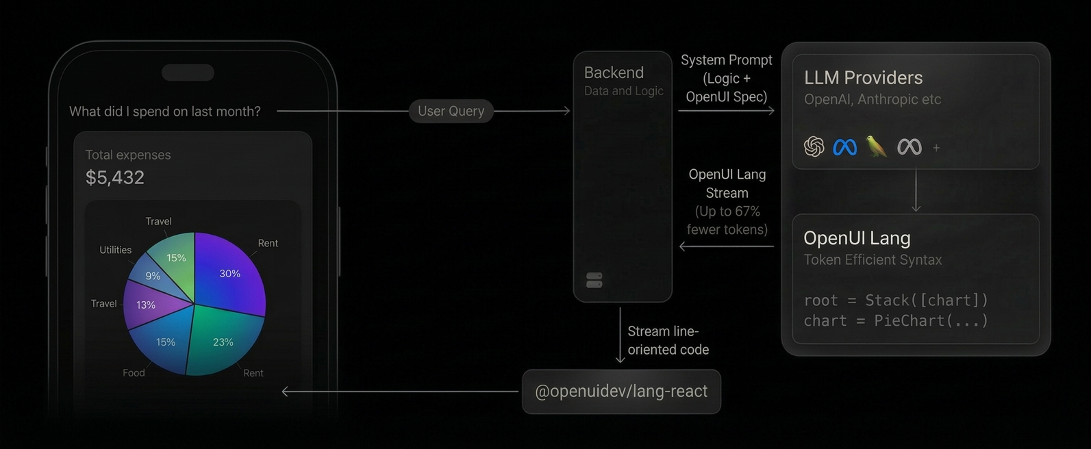
OpenUI is a full-stack Generative UI framework (a compact streaming-first language, a React runtime with built-in component libraries, and ready-to-use chat interfaces) that is up to 67% more token-efficient than JSON. Generate anything from rich chat responses to fully interactive dashboards.
What is Generative UI?
Most AI applications are limited to returning text (as markdown) or rendering pre-built UI responses. Markdown isn't interactive, and pre-built responses are rigid (they don't adapt to the context of the conversation).
Generative UI fundamentally changes this relationship. Instead of merely providing content, the AI composes the interface itself. It dynamically selects, configures, and composes components from a predefined library to create a purpose-built interface tailored to the user's immediate request, be it an interactive chart, a complex form, or a multi-tab dashboard.

Try it out live
Live interactive demo of OpenUI Chat in action
Architecture at a Glance
-
System prompt includes OpenUI Lang spec: Your backend appends the generated component library prompt alongside your system prompt, instructing the LLM to respond in OpenUI Lang instead of plain text or JSON.
-
LLM generates OpenUI Lang: Instead of returning markdown, the model outputs a compact, line-oriented syntax (e.g.,
root = Stack([chart])) constrained to your component library. -
Streaming render: On the client, the
<Renderer />component parses each line as it arrives and maps it to your React components in real-time. Structure renders first, then data fills in progressively.
The result is a native UI dynamically composed by the AI, streamed efficiently, and rendered safely from your own components. For data-driven apps with live tools and reactive state, see Architecture.
OpenUI Lang
OpenUI Lang is a compact, line-oriented language designed specifically for Large Language Models (LLMs) to generate user interfaces. It serves as a more efficient, predictable, and stream-friendly alternative to verbose formats like JSON. For the complete syntax reference, see the Language Specification.
Why a New Language?
While JSON is a common data interchange format, it has significant drawbacks when streamed directly from an LLM for UI generation. And there are multiple implementations around it, like Vercel JSON-Render and A2UI.
OpenUI Lang was created to solve these core issues:
-
Token Efficiency: JSON is extremely verbose. Keys like
"component","props", and"children"are repeated for every single element, consuming a large number of tokens. This directly increases API costs and latency. OpenUI Lang uses a concise, positional syntax that drastically reduces the token count. Benchmarks show it is up to 67% more token-efficient than JSON. -
Streaming-First Design: The language is line-oriented (
identifier = Expression), making it trivial to parse and render progressively. As each line arrives from the model, a new piece of the UI can be rendered immediately. This provides a superior user experience with much better perceived performance compared to waiting for a complete JSON object to download and parse. -
Robustness: LLMs are unpredictable. They can hallucinate component names or produce invalid structures. OpenUI Lang validates output and drops invalid portions, rendering only what's valid.
Same UI component, both streaming at 60 tokens/sec. OpenUI Lang finishes in 4.9s vs JSON's 14.2s — 65% fewer tokens.
JSON Format
OpenUI Lang
What can you build?
Want to try it? Open the Playground or follow the Quick Start.