Theming
Customize colors, typography, and branding for Chat components.
Built-in chat layouts mount their own ThemeProvider by default. Use the theme prop to control mode and token overrides, or disable the built-in provider if your app already wraps the UI in its own theme scope.
There are two common theming paths:
- set
theme.modewhen you only need light or dark mode - pass
lightThemeanddarkThemewhen you need token-level visual customization
Set the mode
import { FullScreen } from "@openuidev/react-ui";

<FullScreen apiUrl="/api/chat" theme={{ mode: "dark" }} agentName="Assistant" />;
Override theme tokens
Use lightTheme and darkTheme inside the theme prop to override the built-in token sets.
import { FullScreen, createTheme } from "@openuidev/react-ui";

<FullScreen
  apiUrl="/api/chat"
  theme={{
    mode: "dark",
    lightTheme: createTheme({
      interactiveAccentDefault: "oklch(0.62 0.22 260)",
    }),
    darkTheme: createTheme({
      interactiveAccentDefault: "oklch(0.72 0.18 260)",
    }),
  }}
  agentName="Assistant"
/>;
If you only pass lightTheme, those overrides are also used as the fallback for dark mode.
Use your own app-level theme provider
If your app already wraps the page in ThemeProvider, disable the built-in wrapper on the chat layout.
import { FullScreen } from "@openuidev/react-ui";

<FullScreen apiUrl="/api/chat" disableThemeProvider agentName="Assistant" />;
disableThemeProvider only skips the wrapper. It does not remove any chat functionality.
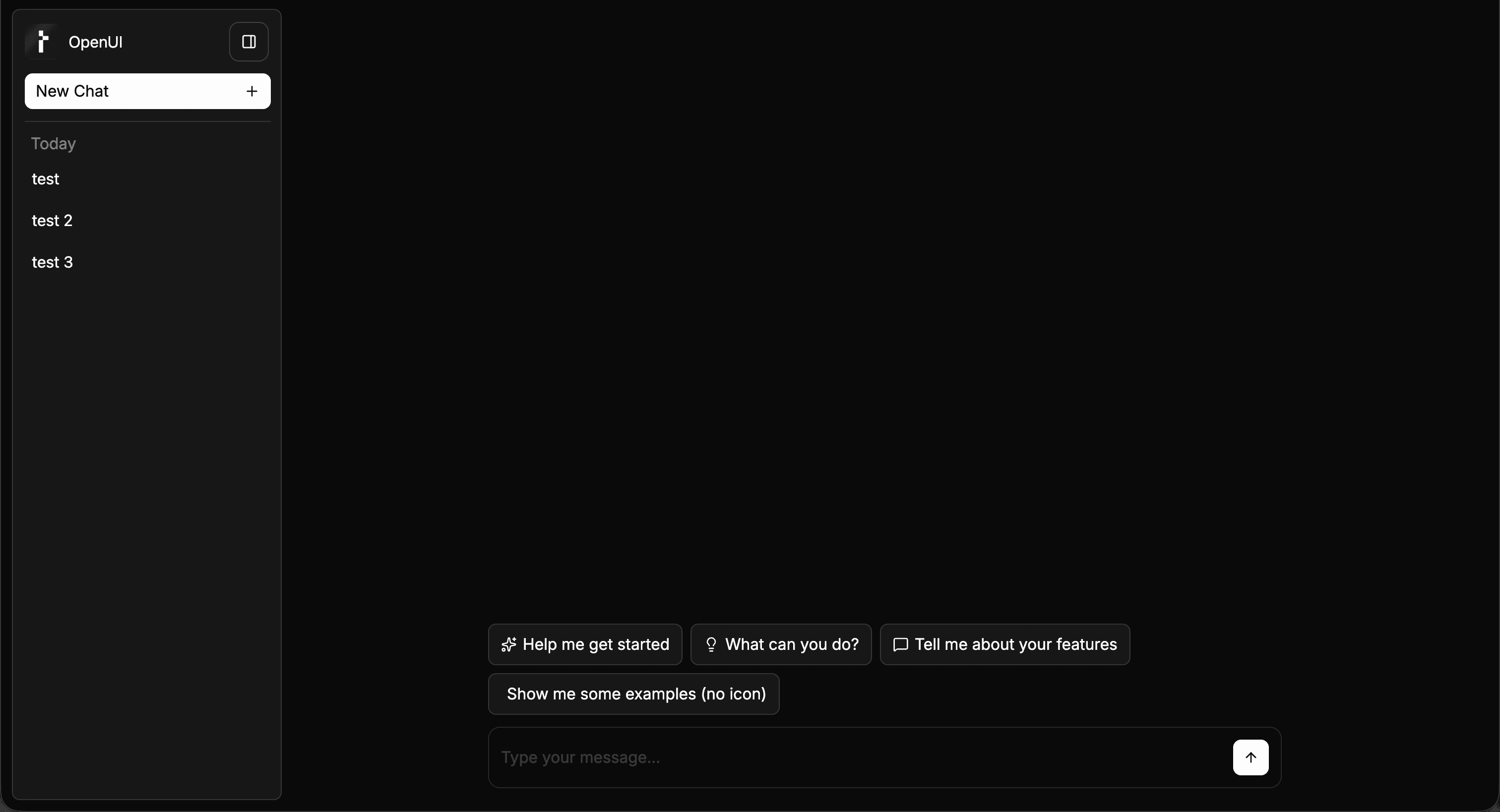
Light (default)
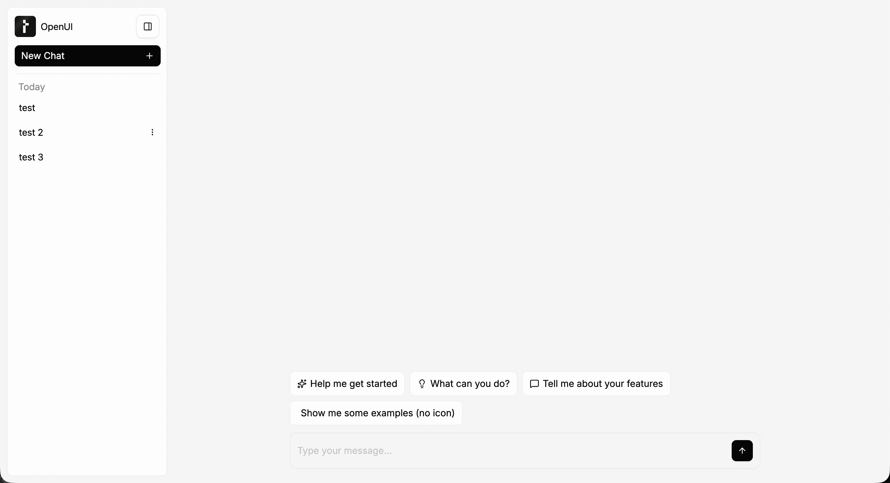
Dark